Exhibitions have dimension…


The brief
We were asked to create an identity for Colchester Means Business which would be both recognisable and memorable; one which had longevity and contemporaneity. Part of our process was to look at peer events on both a local and national level. This would help us ensure that any designs we developed would be both unique and differentiated.
Timing was tight and everything was starting from scratch. There were also a number of stakeholders in the exhibition, so any solution we came up with had to gain the approval of all involved.


What we did
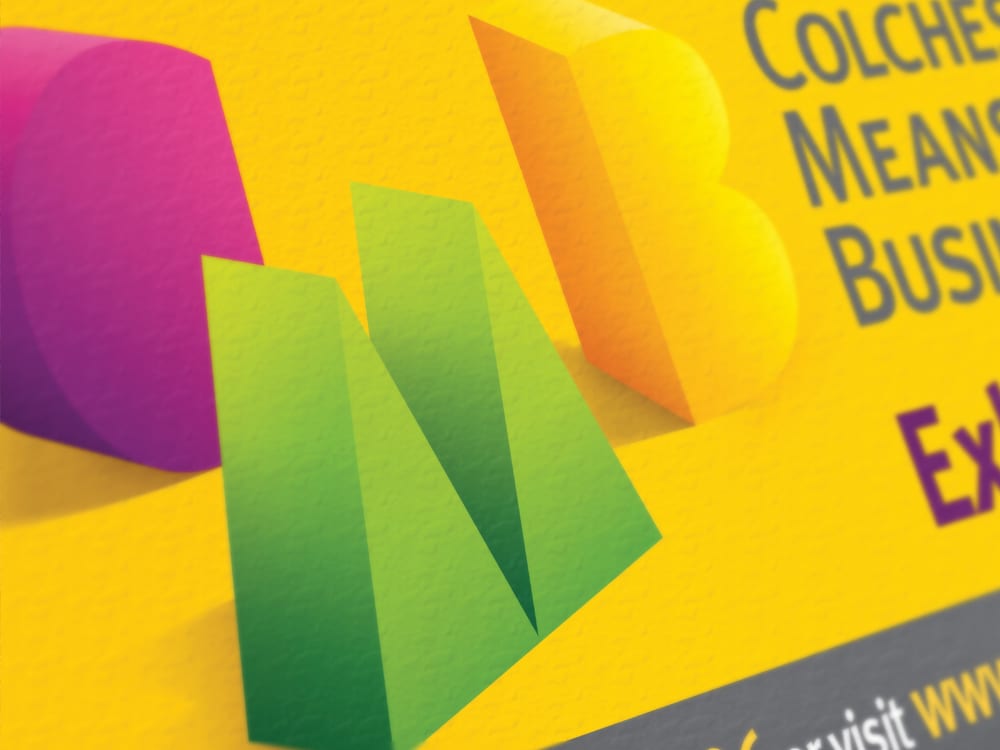
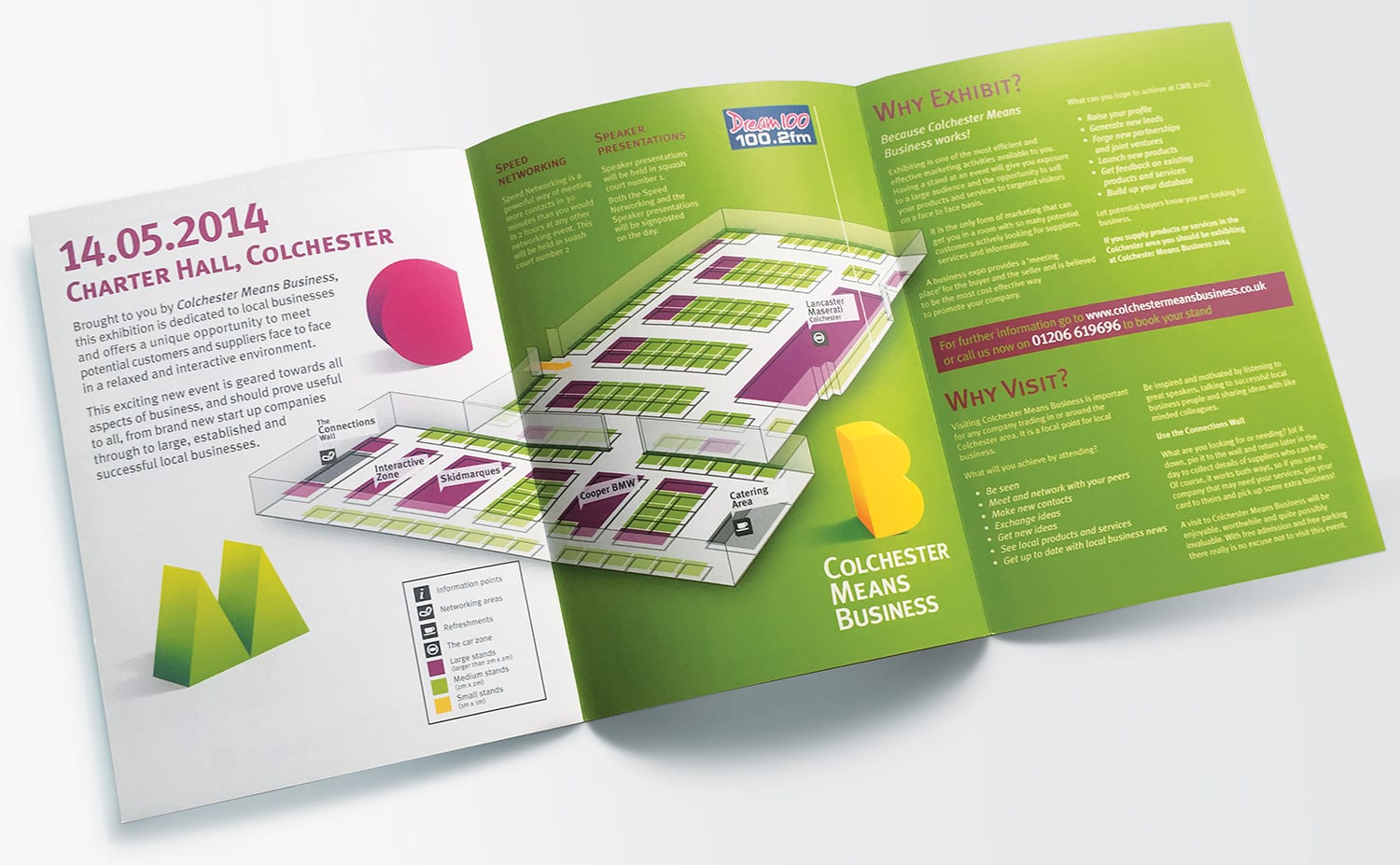
Our solution was based around the idea that an exhibition is physical: It’s an environment that you can walk around and navigate. The three–dimensional quality of an exhibition is really important; it’s what makes it engaging.
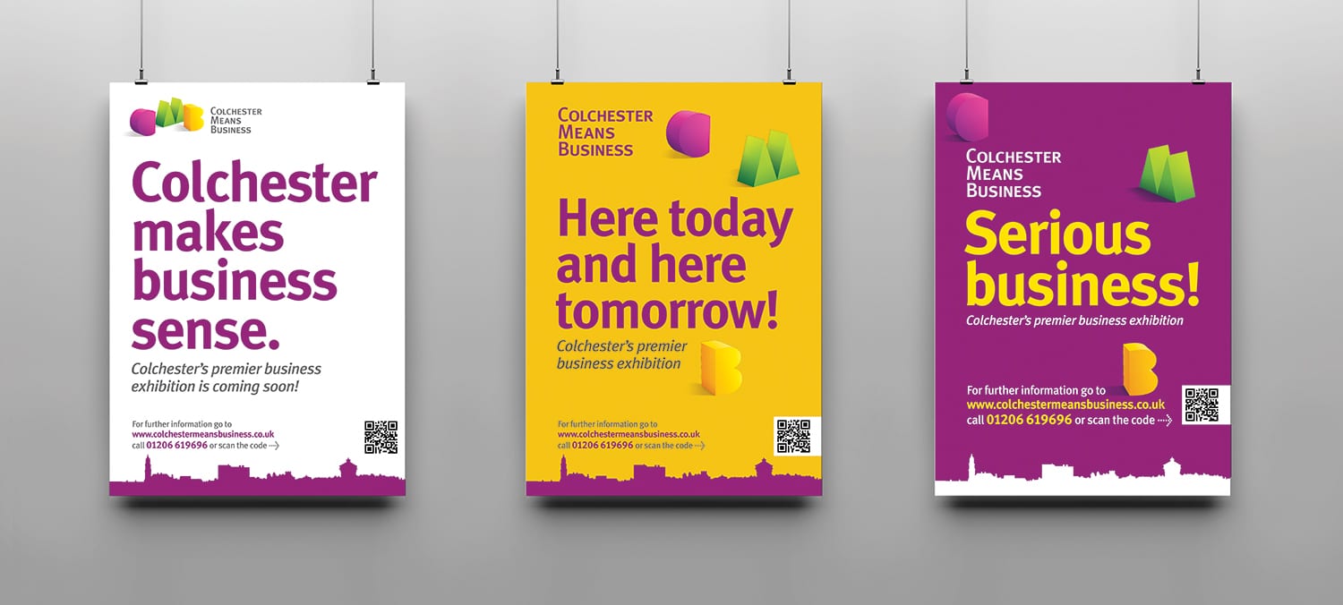
Our bold simplified letters were a flexible, visually solid solution. Each ‘letter’ of the logo having a number of versions which were able to go for a wander: to move within each of the applications canvas. This meant that no two applications used exactly the same branding elements, but always felt connected.
Together with the bold, vibrant colour scheme and simple Colchester horizon line this identity becomes both ownable and relevant. The final applications were striking an memorable, an identity to be proud of.

Call 01206 580179 or mail us now…
Fancy a chat about your branding over Zoom? It’s FREE and could be the start of something big!


