Scoof, the scoop with a twist
Scoof brand identity
The brief
Scoof came to us in 2013 to help create branding and packaging for a new product that was designed to help clean cafetieres out. It was an item that wasn’t known nor looked for. We were also asked for advice about the design of the product itself. This was the start of a relationship that still exists today.
What we did
The first area we worked on was the naming and branding. Working very closely with the inventor, the name ‘Scoof’ was settled upon.
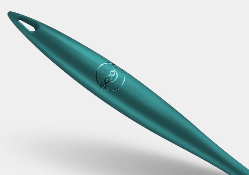
The personality of Scoof is friendly, helpful, but at the same time it is stylish enough to be left in view. Scoof really is a talking point. Our branding is simple. Scoof with a smile, using the tagline: A scoop with a twist. This sums up what it does and what it is.
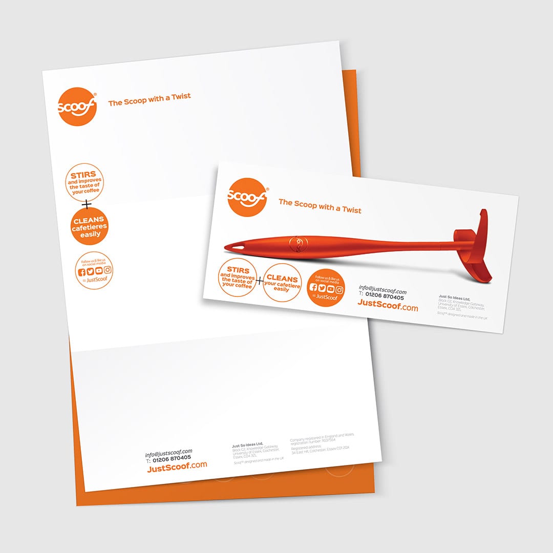
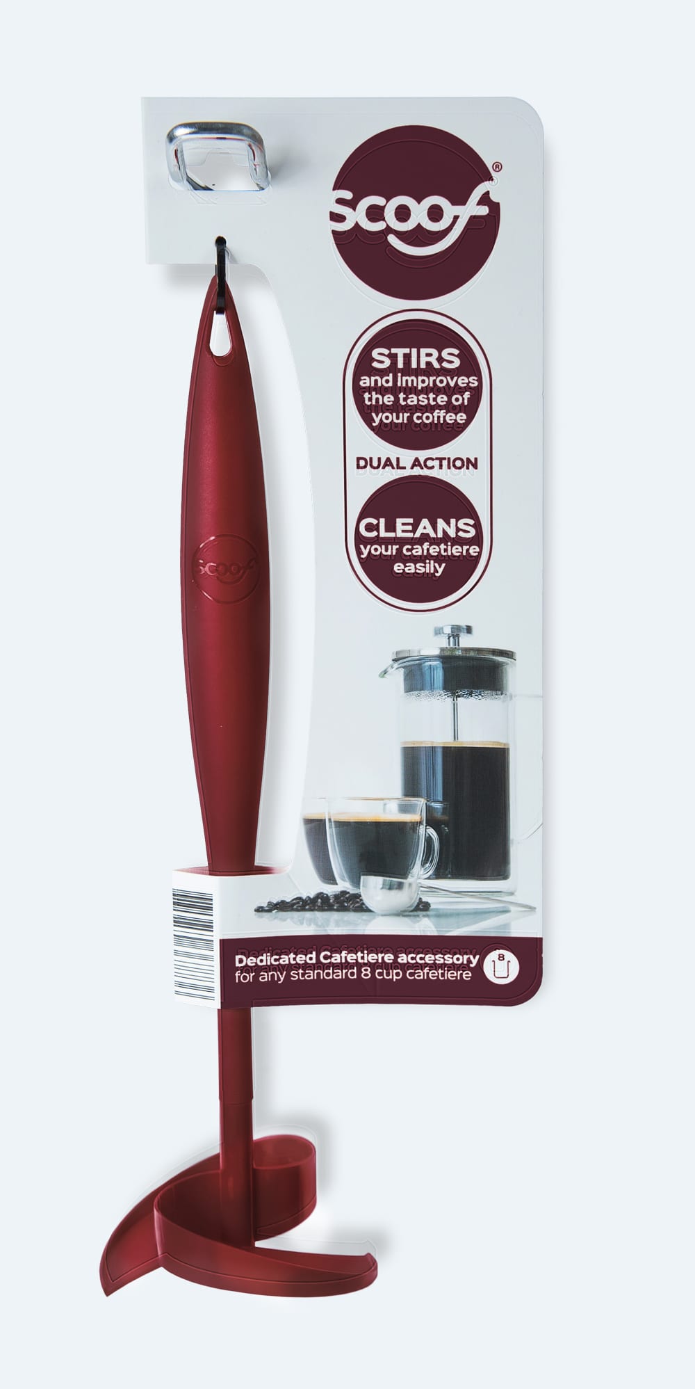
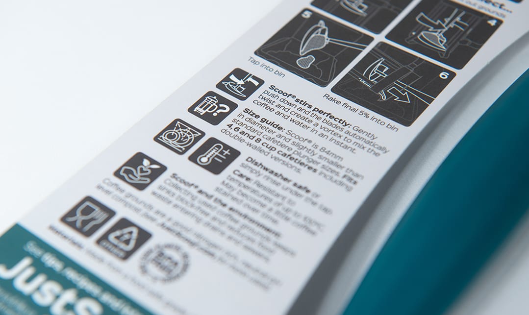

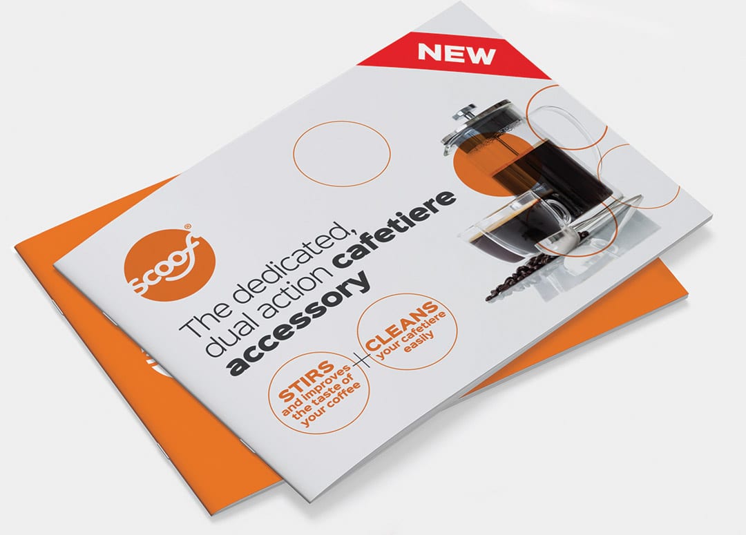
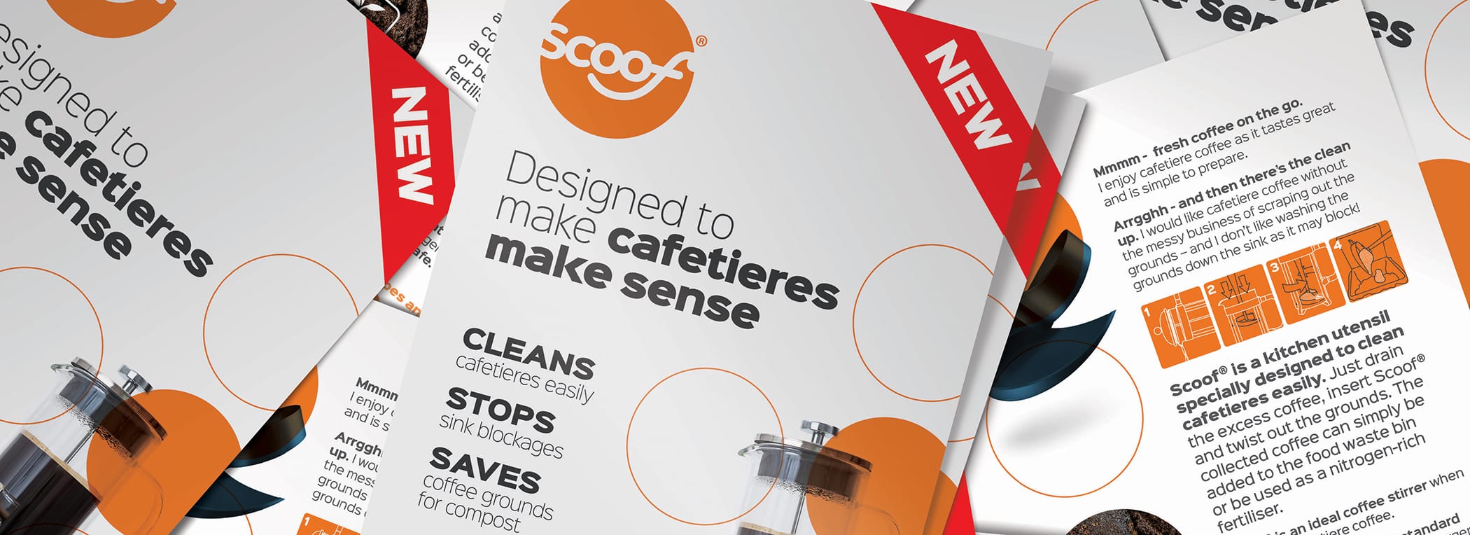
The look and feel has echoes of the 1970’s. A little cool, a cheeky look back. Using the roundel of the ‘logo’ as the cue, repeating circles play a big part. Simple typography, and a reduced colour palette.
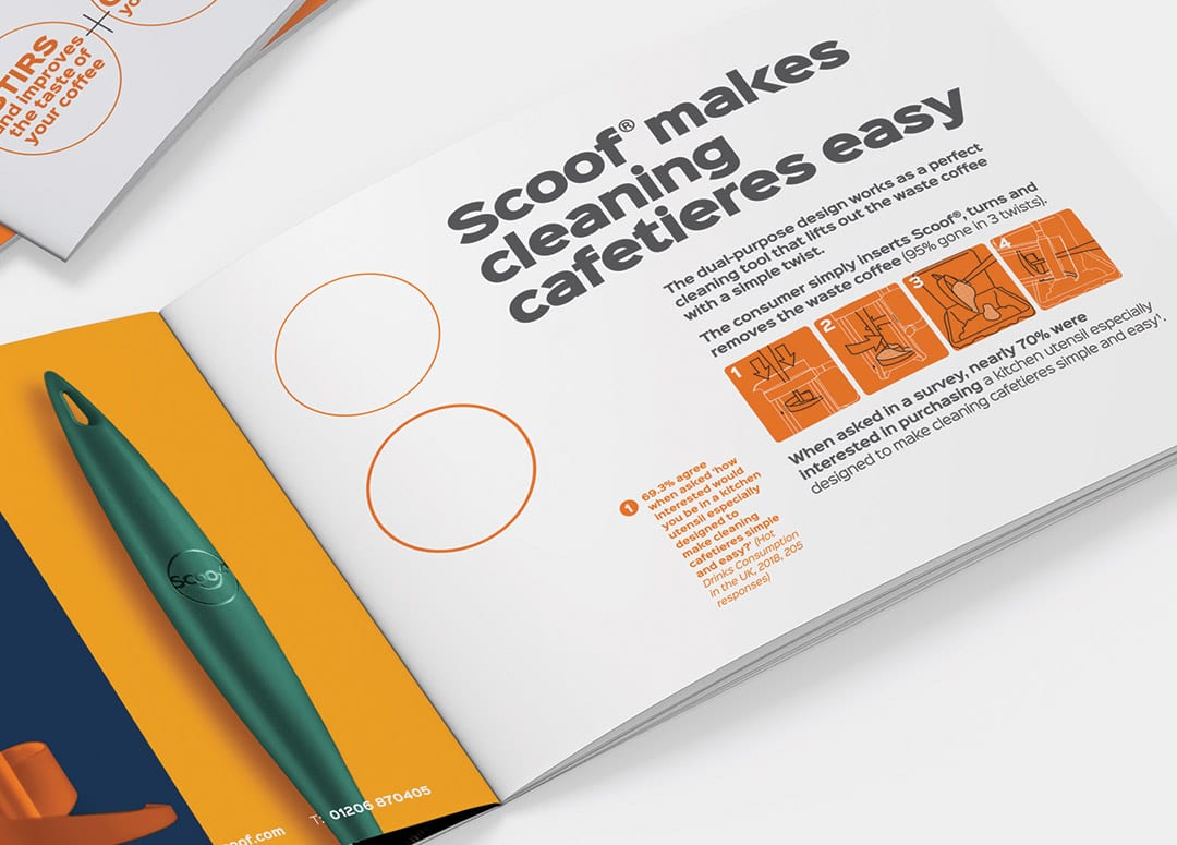
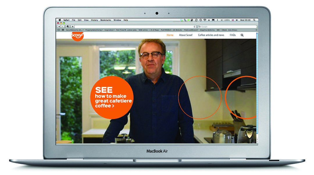
The asymmetrical packaging uses simple, strong messaging. Highlighting the two main benefits of Scoof: Stirs and Cleans. With the back utilising specially created illustrations to show how it works. This messaging permiates all applications, even through to video. Puur also helped deliver video content to help grow the audience of Scool. See the Scoof YouTube channel here.
Working across all touch points, Scoof has an identity that gives both consumers and retailers confidence in the product; a product that no one is aware they need – Scoof, the scoop woth a twist.
At a glance
- Client: Just So Ideas
- Category: Naming, Branding, Packaging, Literature, Digital
- Website: JustScoof.com

Call 01206 580179 or mail us now…
Fancy a chat about your branding over Zoom? It’s FREE and could be the start of something big!


