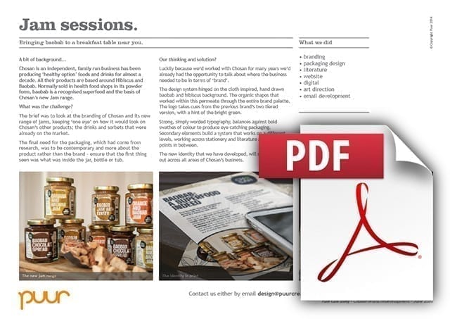
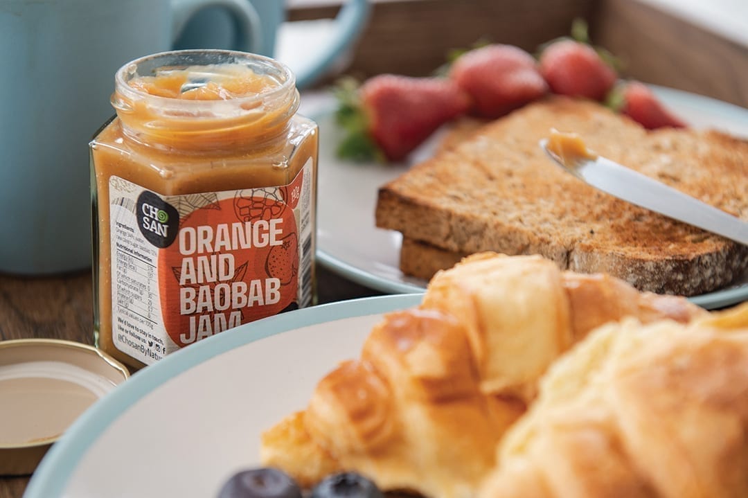
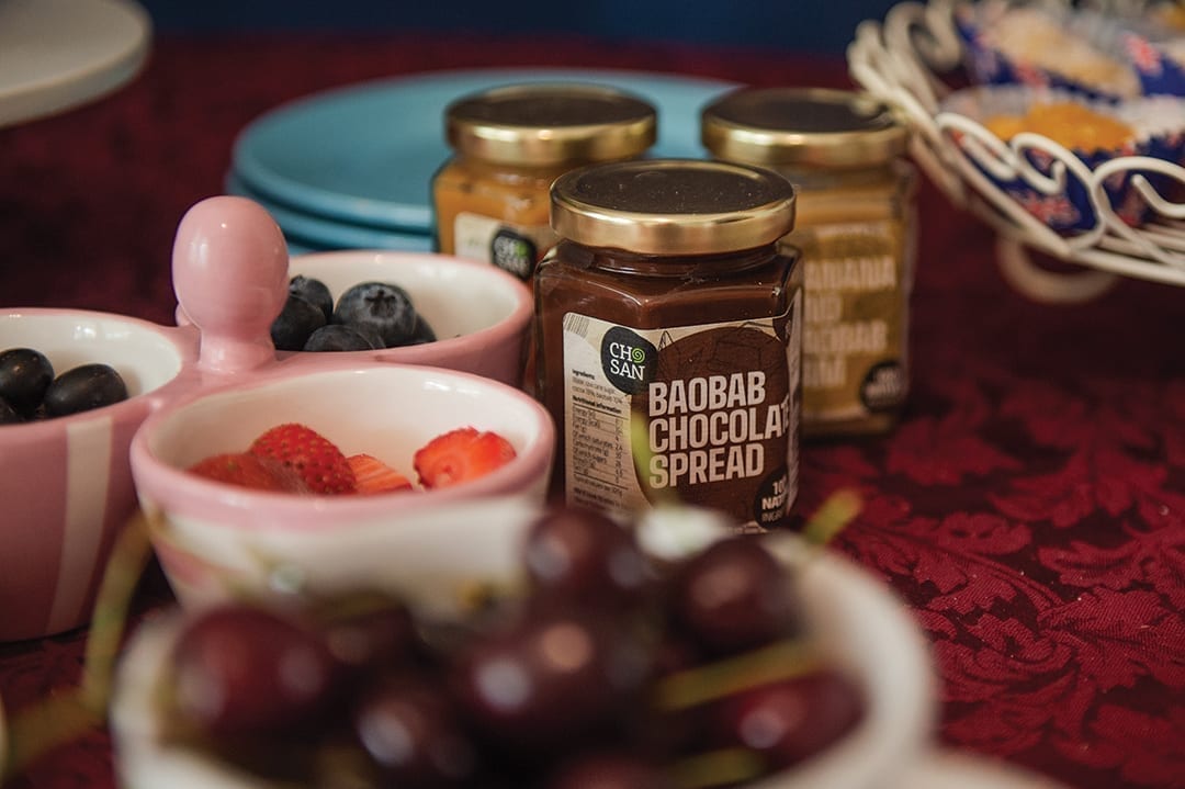
The Chosan brand is an independent, family run business that has been producing ‘healthy option’ foods and drinks for almost a decade. All their products are based around Hibiscus and Baobab. Normally sold in health food shops in its powder form, baobab is a recognised superfood and the basis of Chosan’s new Jam range. This exotic new option for spreading on the morning’s toast or scones for afternoon tea, is inspired by the fruits and flavours of Africa.
The Chosan Jam sessions
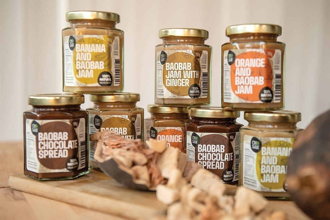
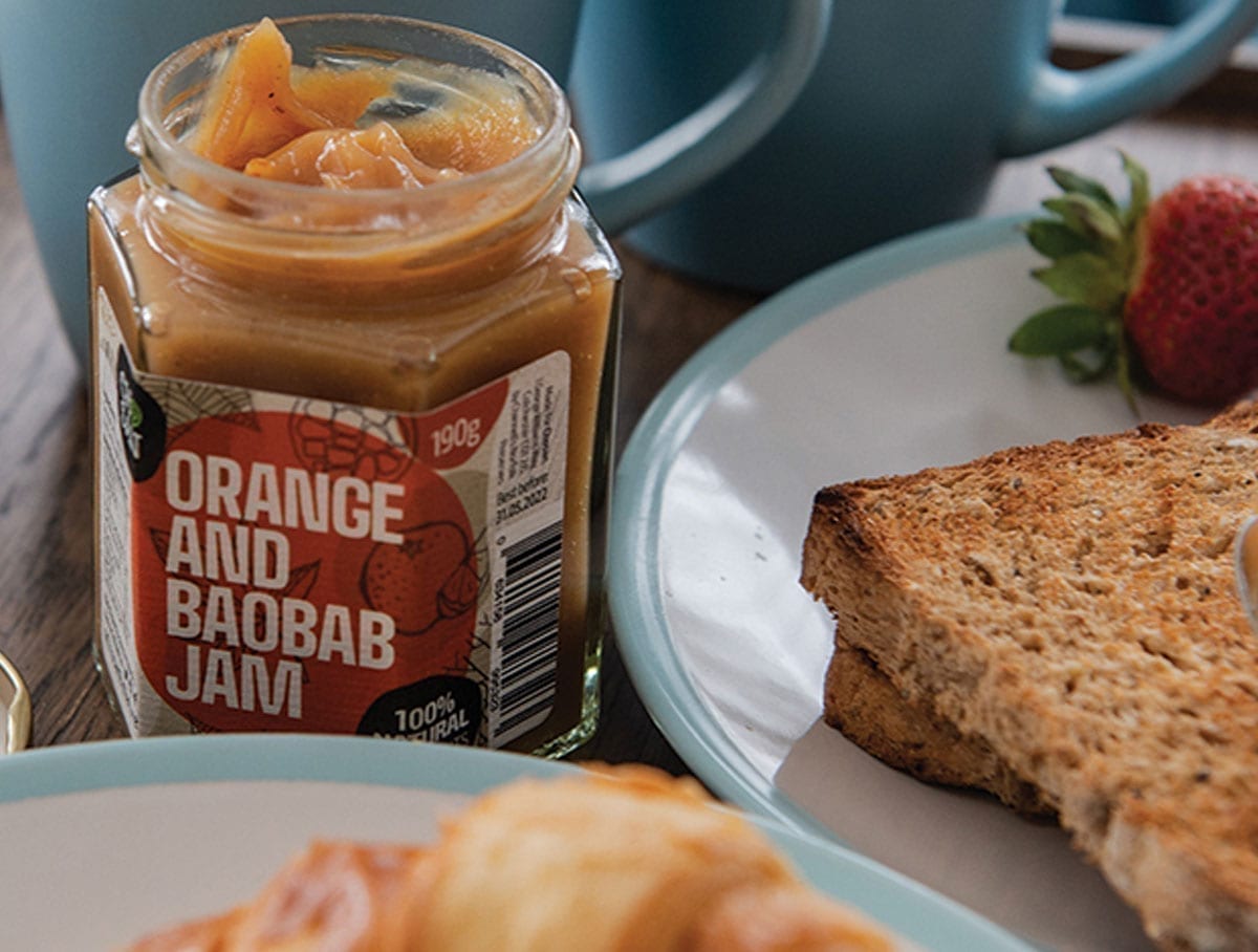
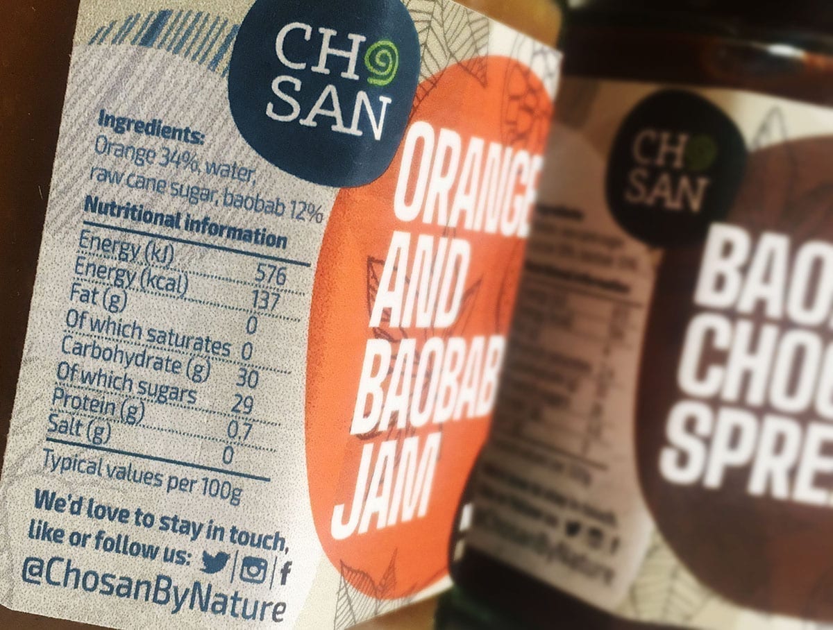
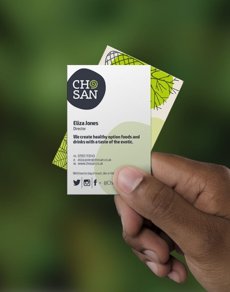
Chosan branding
The brief
This was a project which started mid March when Puur, like a lot of other companies in the UK had to moved their entire business to remote working. With meetings, which would have normally been face to face, needing to become web calls with screen sharing presentations, this wasn’t a run of the mill project.
The brief itself was to look at the branding of Chosan and its new range of jams, keeping ‘one eye’ on how it would look on Chosan’s other products; the drinks and sorbets that were already on the market. It was felt that the products needed to give a more contemporary impression of West Africa than the previous identity had done.
The final need for the packaging, which had come from research, was to be more about the product rather than the brand – ensure that the first thing seen was what was inside the jar, bottle or tub. Be loud and proud!
What we did
Luckily because we’d worked with Chosan for many years we’d already had the opportunity to talk about where the business needed to be in terms of ‘brand’. We’d also had the opportunity to gain feedback from meetings with peer organisations. Add this to desk research and historic documents, we were in quite a good place to begin with.
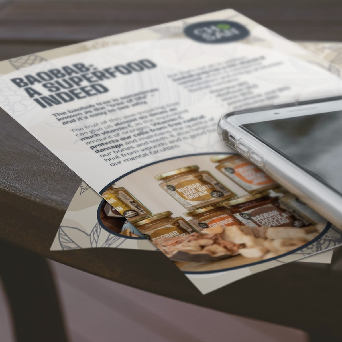
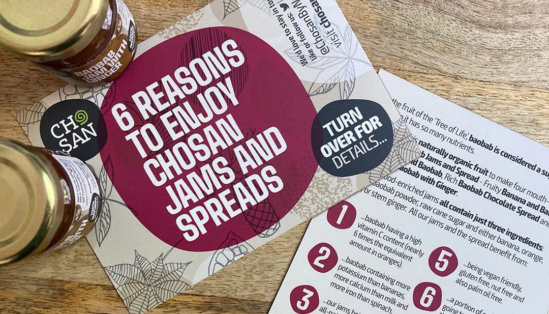
The design system hinged on the cloth inspired, hand drawn baobab and hibiscus background. The organic shapes that worked within this permeate through the entire brand palette. The logo takes cues from the previous brand’s two tiered version, with a hint of the bright green.
Strong, simply worded typography, balances against bold swathes of colour to produce eye catching packaging. Secondary elements build a system that works on different levels, across stationery and literature and all touch points in between.
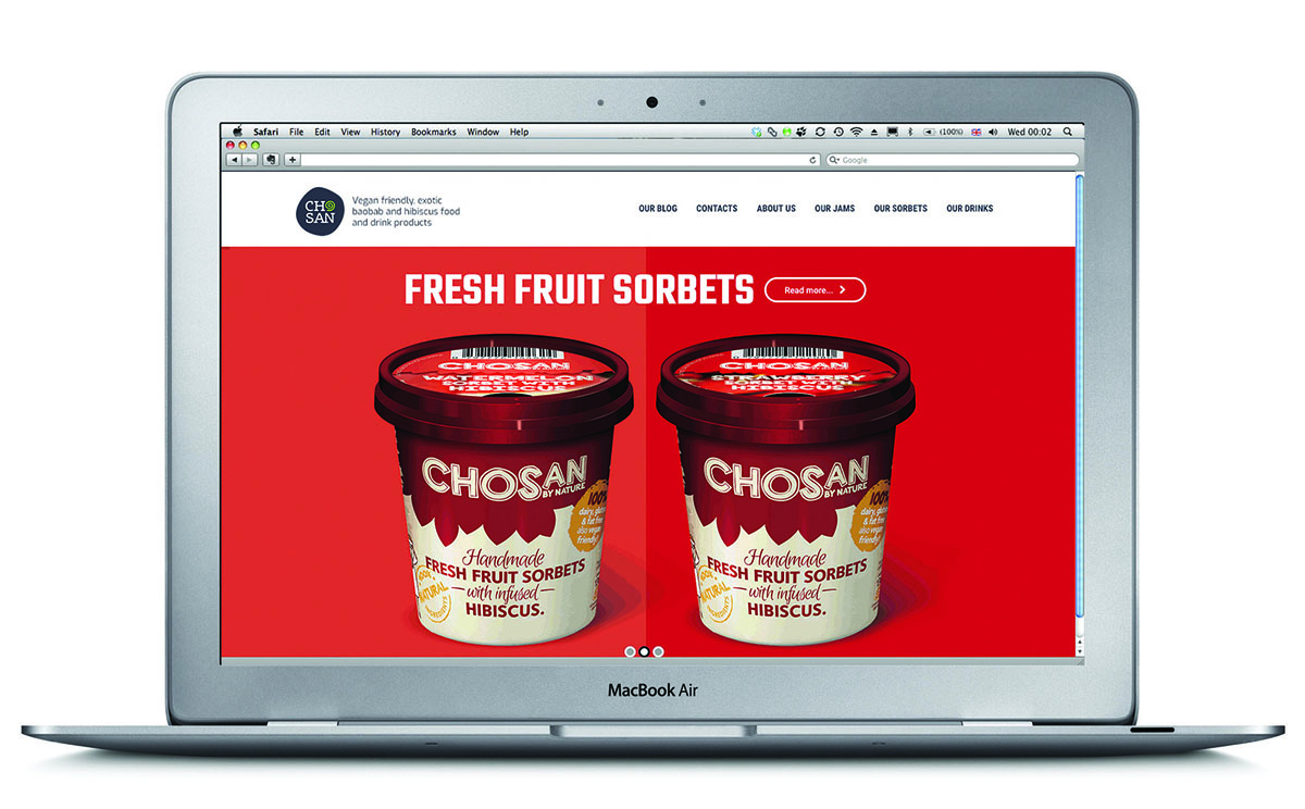
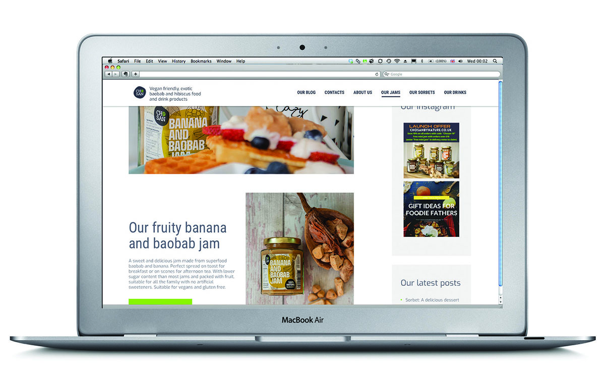
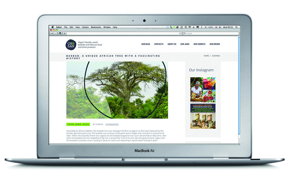
The new identity that we have developed, will now be rolled out across all areas of Chosan’s business. Starting with a rebranded website, social media and the new jam packaging. This will progress through to repackaging their fresh fruit hibiscus infused sorbets and organic drinks when stocks are replenished.
Downloads and info…
Client: Chosan
Website: www.chosanbynature.co.uk/
Branding
Packaging design
Literature
Website
Digital
Art direction
Email development
Base image for the leaflet and stationery by Jade Seok and Anomaly on Unsplash. Main Jam images by Big Fish Photography

