Planting the seeds…

The brief
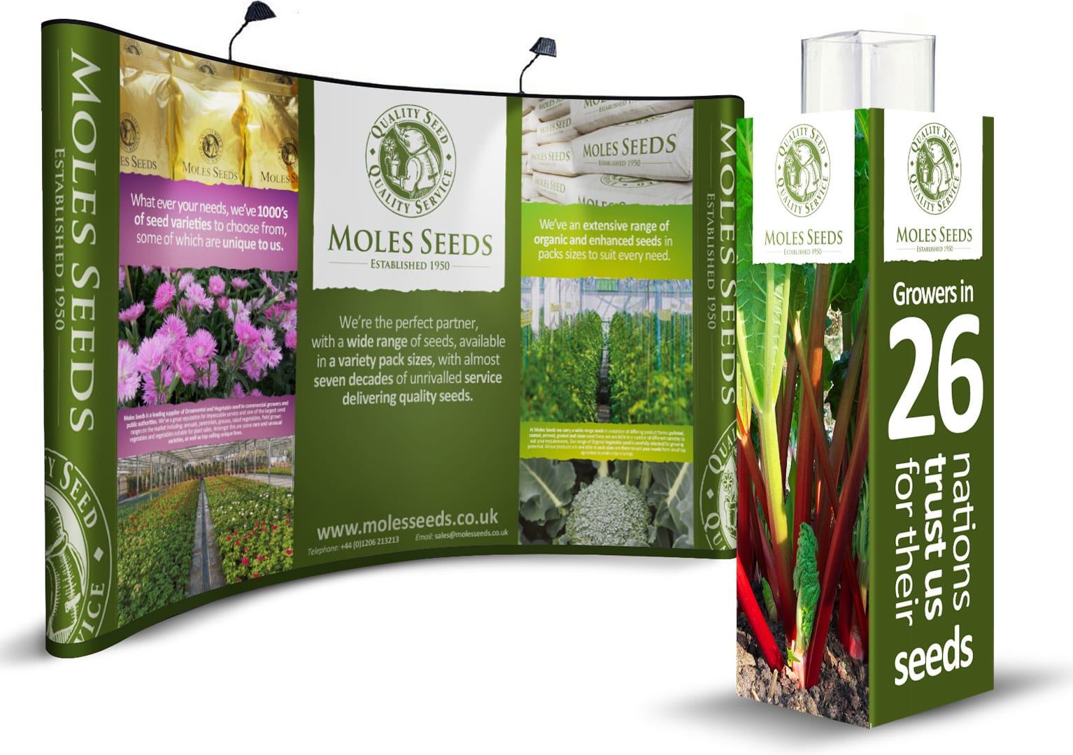
The challenge Moles Seeds had was one of inconsistency over all its touch points. As well as this, the customers of Moles Seeds were not aware of a lot of what the company did. The first part of the project was rationalisation, as well as an organic refinement of the branding elements.
The second part was to help create more ‘buzz’ around all elements of the business. Ensuring that both private customers and large plant producers are aware of what Moles Seeds can offer them.
What we did
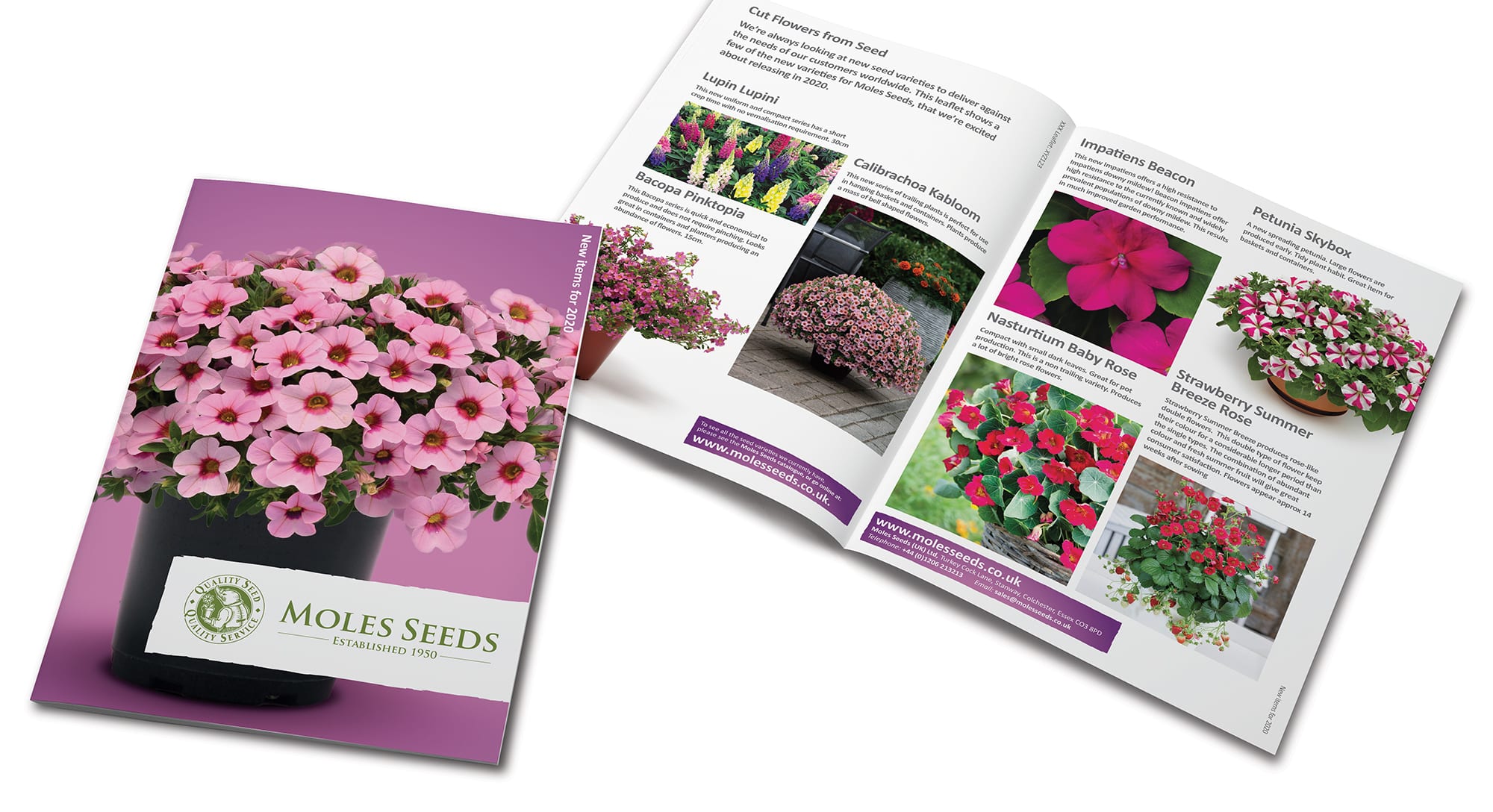
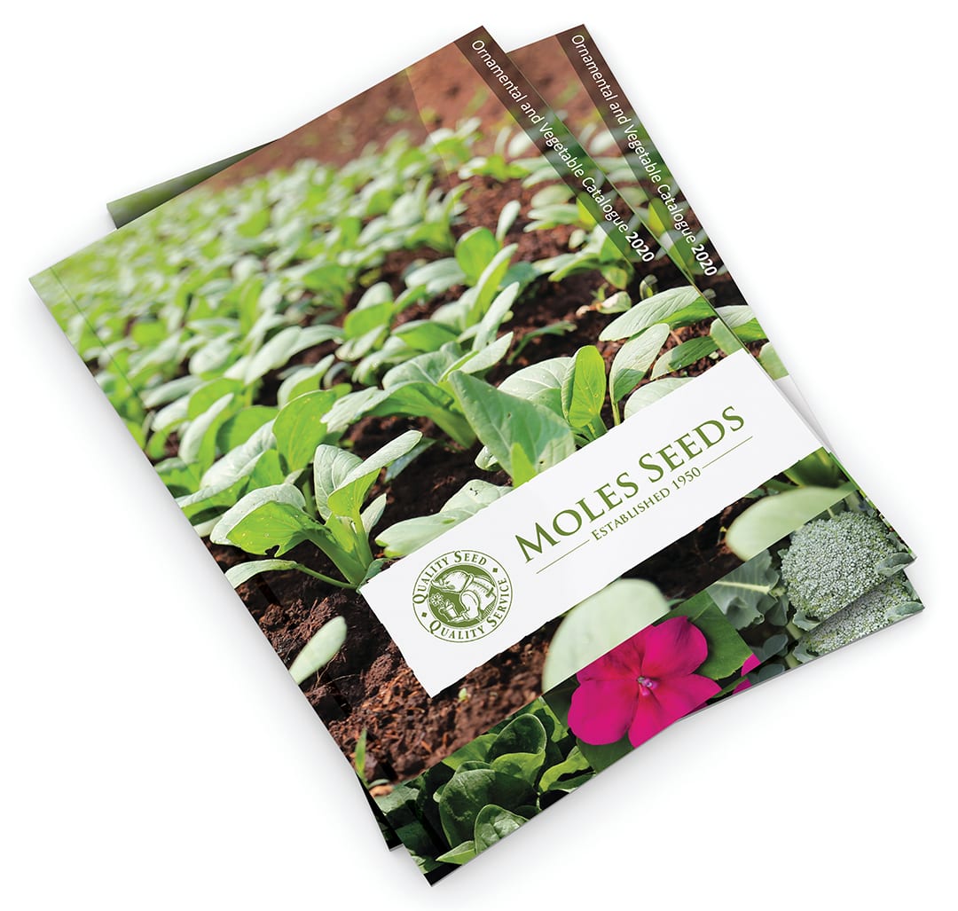
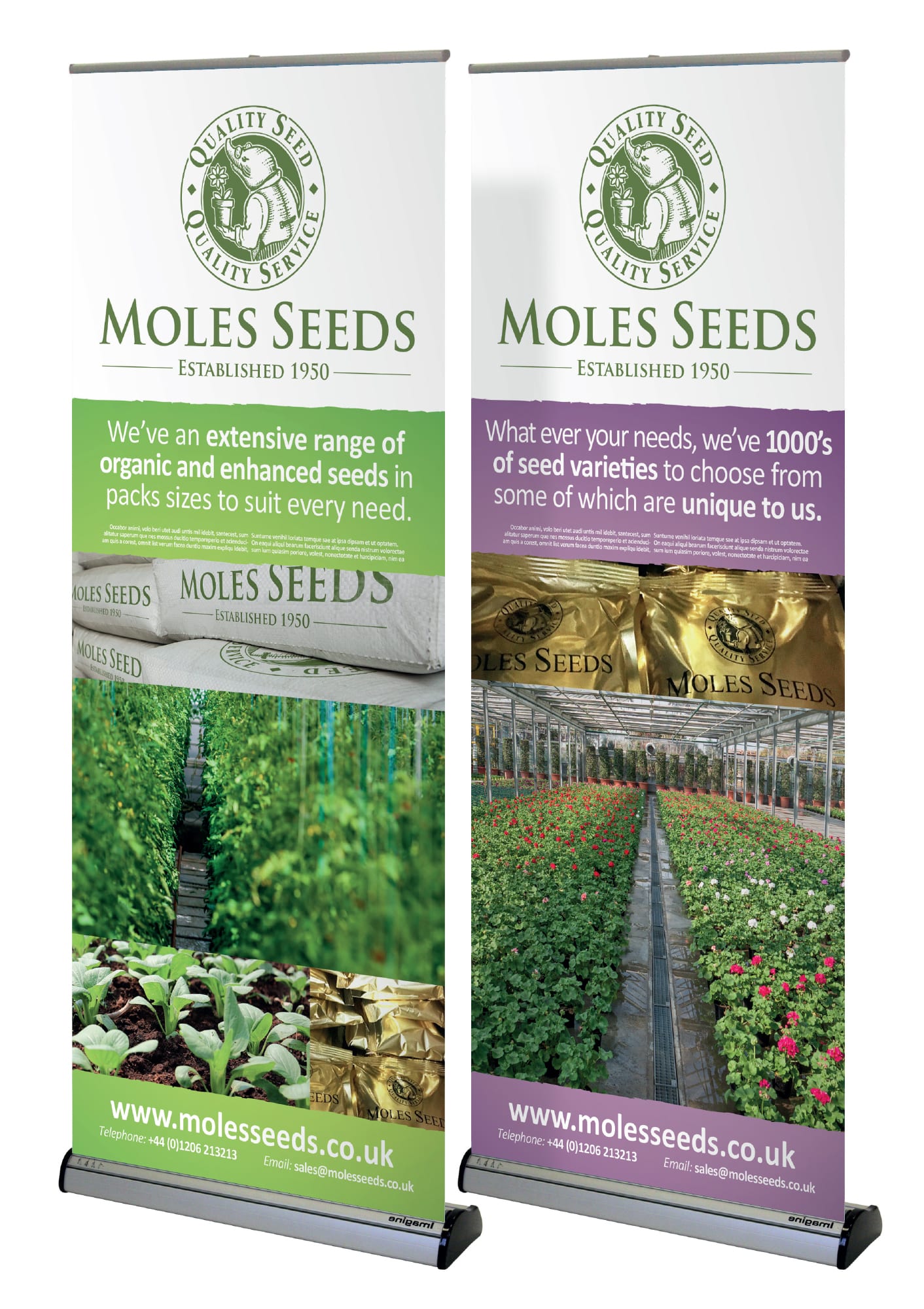
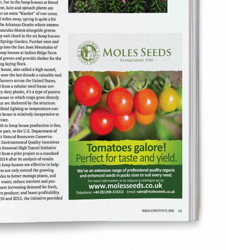
The Moles Seed roundel was well liked and had a quirkiness that made it both recognisable and memorable. Our first job was to create a much stronger lock-up between the symbol and logotype – adding the ‘established’ element. This created a much stronger foundation for all the elements to work around. On each piece of collateral, the branding is now seen on the white ‘deckled edge’ banner background to ensure standout.
We then worked on differentiating the vegetable and flower seed business. Both are important, but their offer and audience are slightly different. To help Moles Seeds move forwards we needed to show that the subtle differences were more evident. The wording for the two areas of the business was crafted and subtle differences in image choice (ie seed pack sizes) helped reinforce that subtle distance.
Finally we helped strengthen their messaging, ensuring that collateral worked hard to deliver against its objectives, talking to the intended audience in the right way for the business.
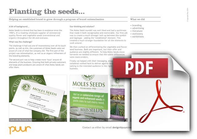
Downloads and info…
Client: Moles Seeds
Website: www.wholesale.molesseeds.co.uk
Branding
Advertising
Literature
Stationery
Exhibitions
