Colourmatix Advanced is an Ellisons brand. They are the UK’s leading supplier to hair and beauty professionals, providing a selection of trusted brands to salons, spas and businesses all over the world. Established in 1930, they provide their customers with the latest innovations, exclusive brands and exceptional service.
For starters…
Colourmatix brand identity
The brief
Colourmatix is a successful Ellisons brand that had been in existence for many years. The main focus of Colourmatix has been on nail care, what a strong range of nail varnishes and preparations. The new ‘Advanced’ products were being developed to cover a more than the original brand.
The brief was to look at the branding for the new starter kit elements, creating both front face branding and a visual language for consistently developing back of pack information. The branding had to link strongly with the original brand, but should be definitely seen as a step ‘up’. The kit itself was to be aimed at student therapists.
The refreshed brand was to cover a number of different therapy areas: eyes, face and lips. These three diverse areas needed to be differentiated in a simple way, as did colour and tone. The final part of the brief was that the new deigns needed to be simple enough to be reproduced in a single colour (either white or black) across a variety of media and processes (ie litho, silk screened etc).
What we did
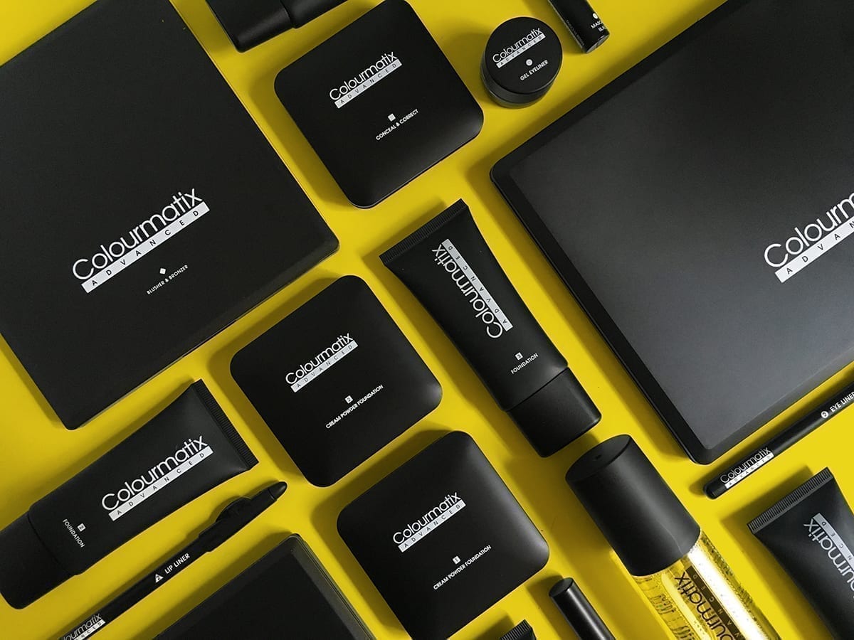
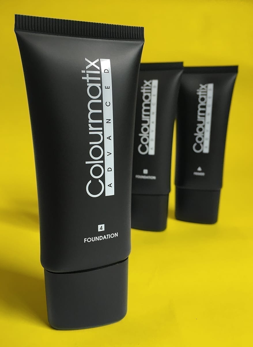
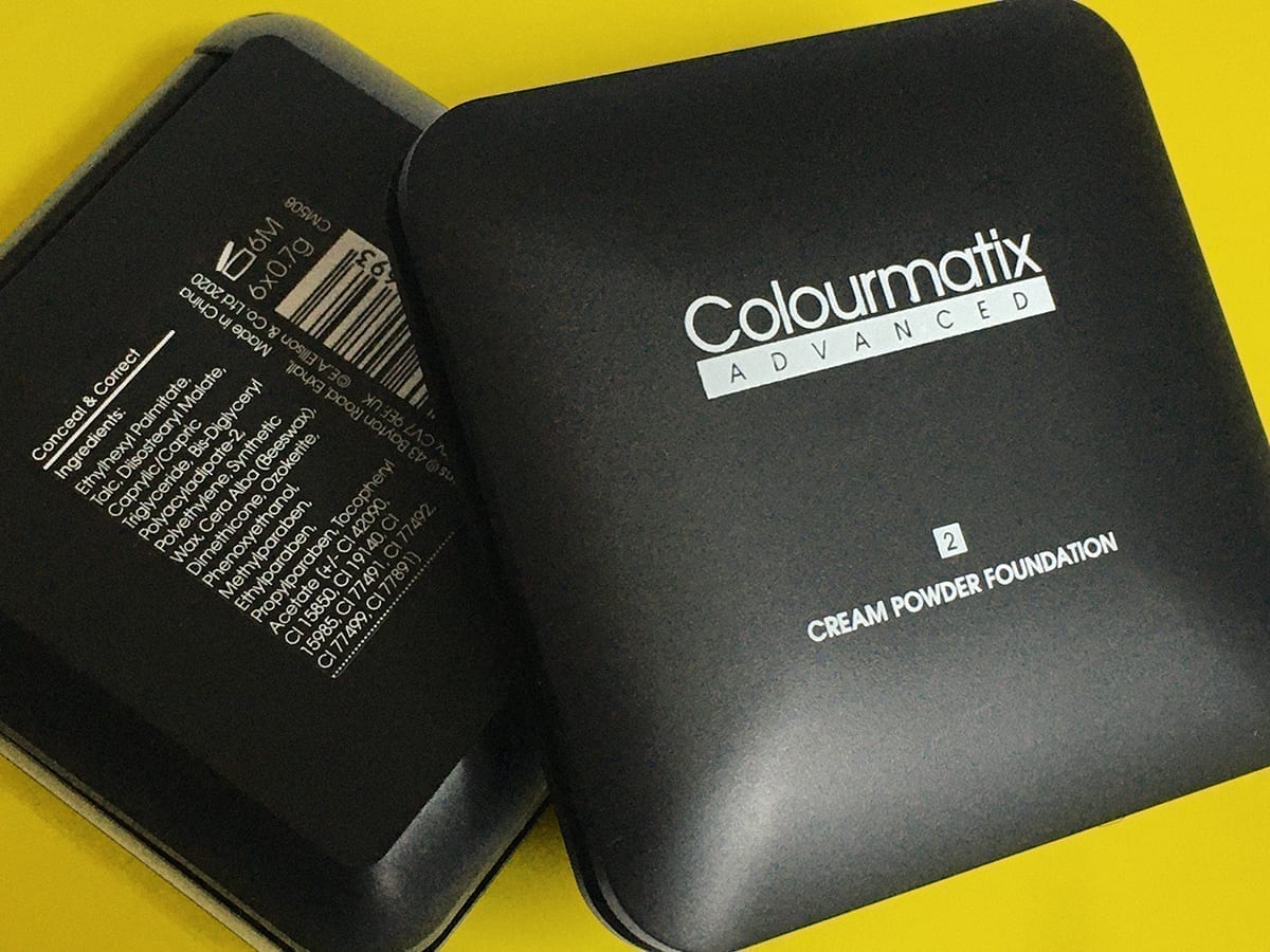
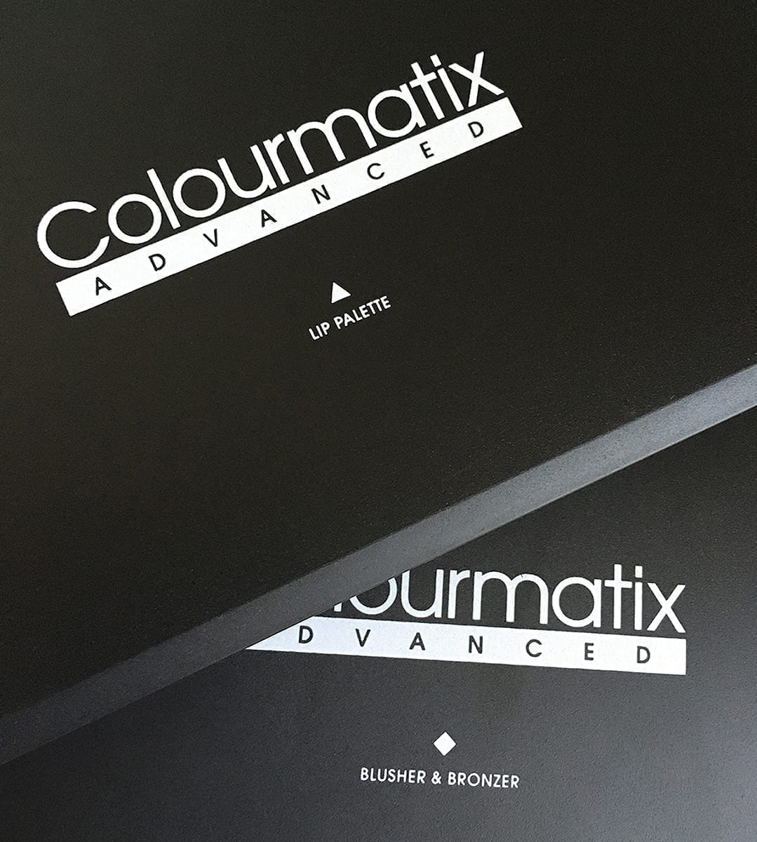
This project had a number of stages, the first was to develop the new branding and the most urgent of all the product packs. After presenting a few different solutions, the final chosen route was the simple ‘bar’ design. This worked well across all the SKU’s we had sight of. Space was a big part of the design solution, allowing the new branding to be the focus, the bar being a strong ‘underscore’.
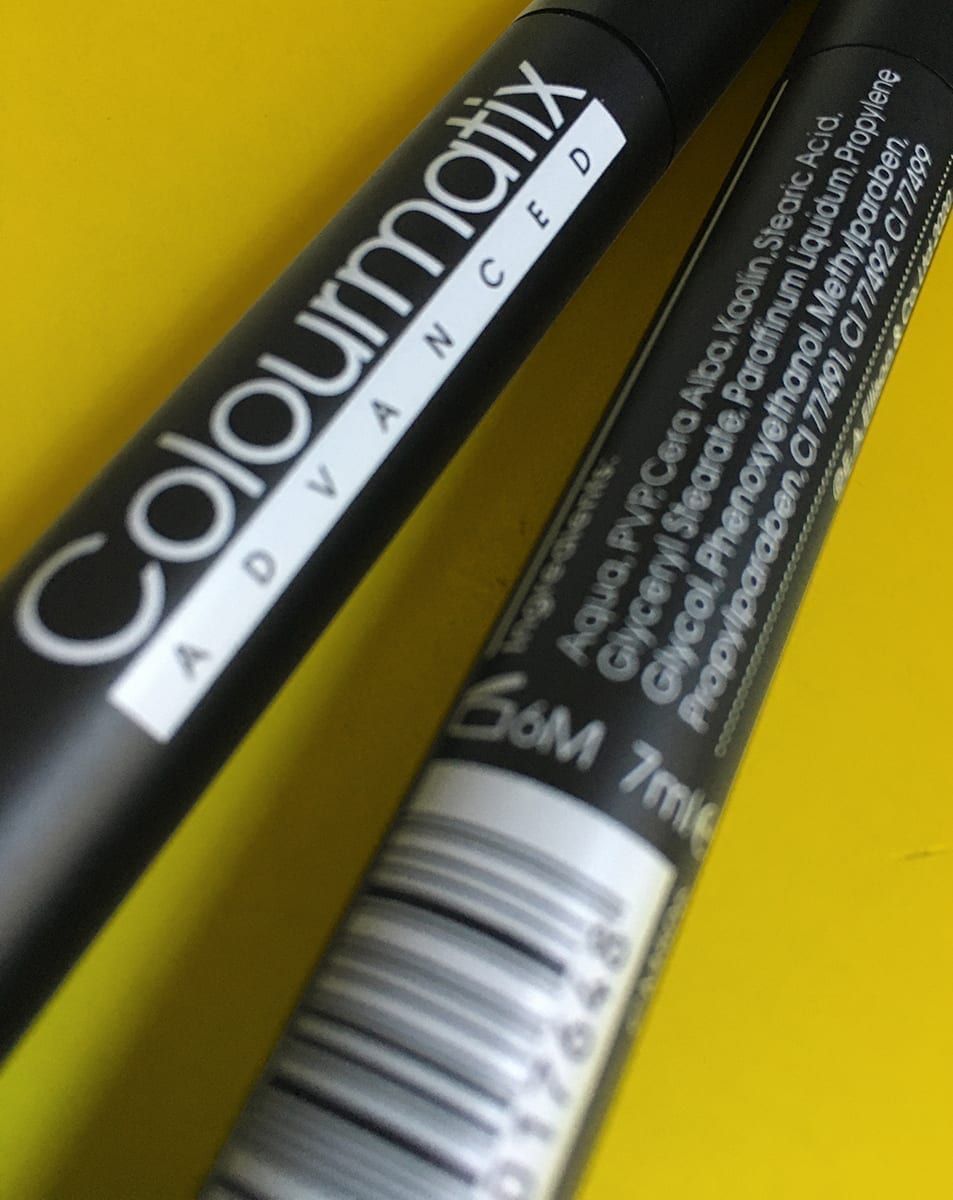
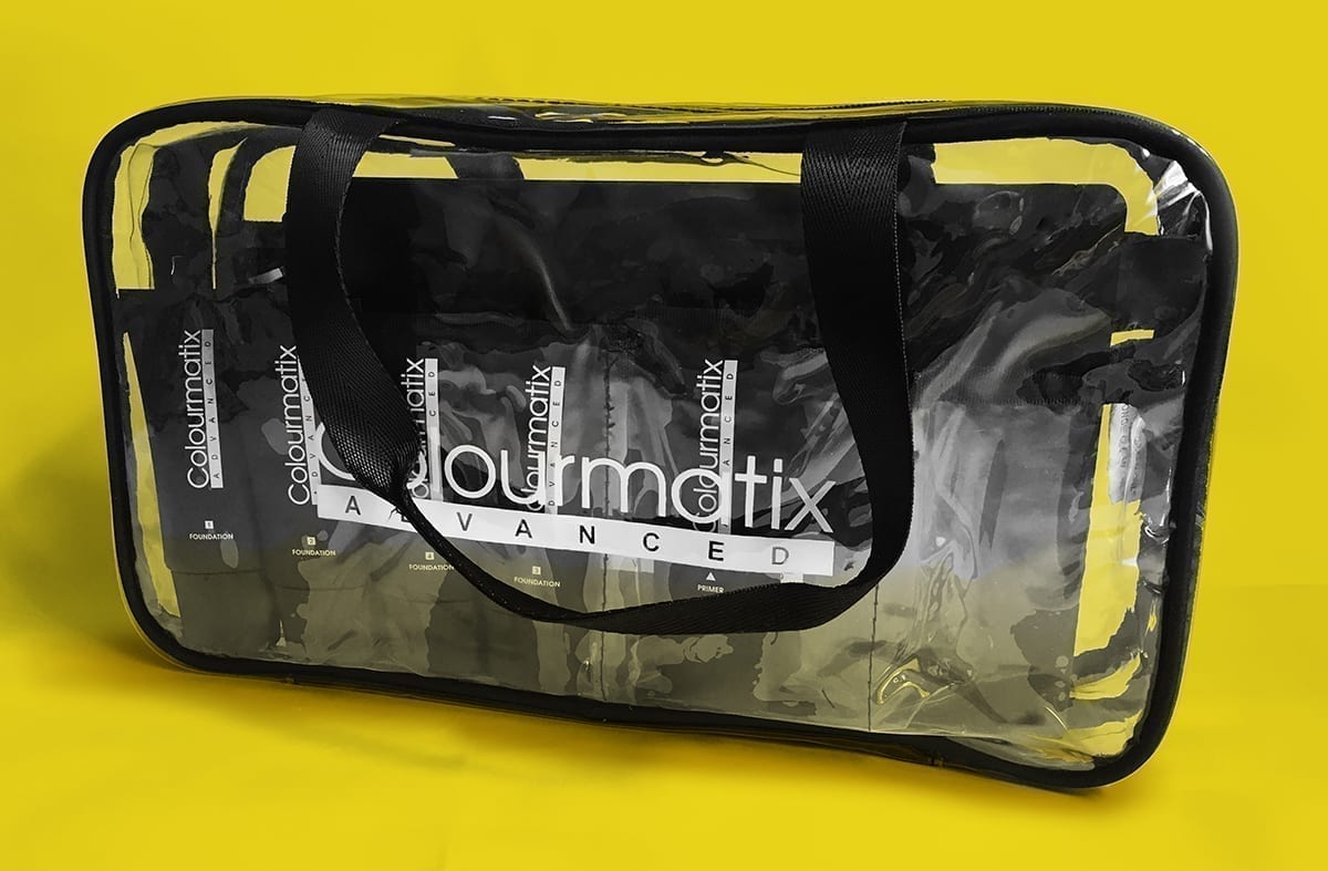
After delivery of the initial 5 designs, the rest of the selection needed to be developed. Working with tight restrictive product areas was the biggest challenge. Keeping a visually consistent brand across everything from a small eye pencil or a large palette for
eye shades showed how versatile the new system was.
Visually separating the products for face, eyes and brows, and lips was done through simple holding shapes. These allowed for further differentiation by adding numbers using the shapes as a holding device.
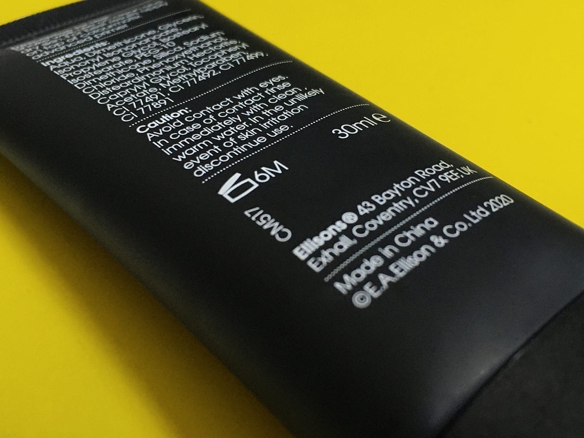
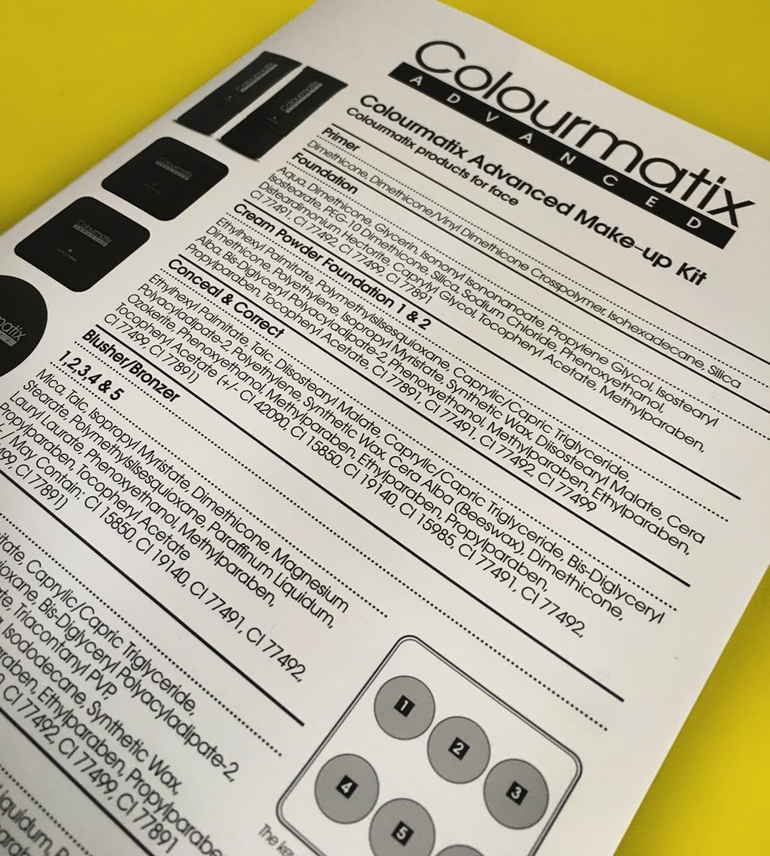
The back of pack designs utilised dotted lines to divide up the information areas, simple text and strong headings. Icons were used to great effect allowing minimal text on the sometimes restrictive canvasses. The final solution is an elegant yet simple design which works across almost 30 different packs.
Downloads and info…
Client: Ellisons
Website: www.ellisons.co.uk
Branding
Packaging design
Literature

Call 01206 580179 or mail us now…
Fancy a chat about your branding over Zoom? It’s FREE and could be the start of something big!

