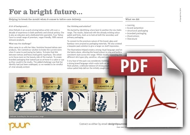
Alice Nicholls is an award-winning tattoo artist with over a decade of experience in both aesthetic and clinical artistry. She is also an educator and a dedicated skin specialist. Four Tattoo Care is a small range of premium, vegan friendly, 100% natural skincare products.
For a bright future
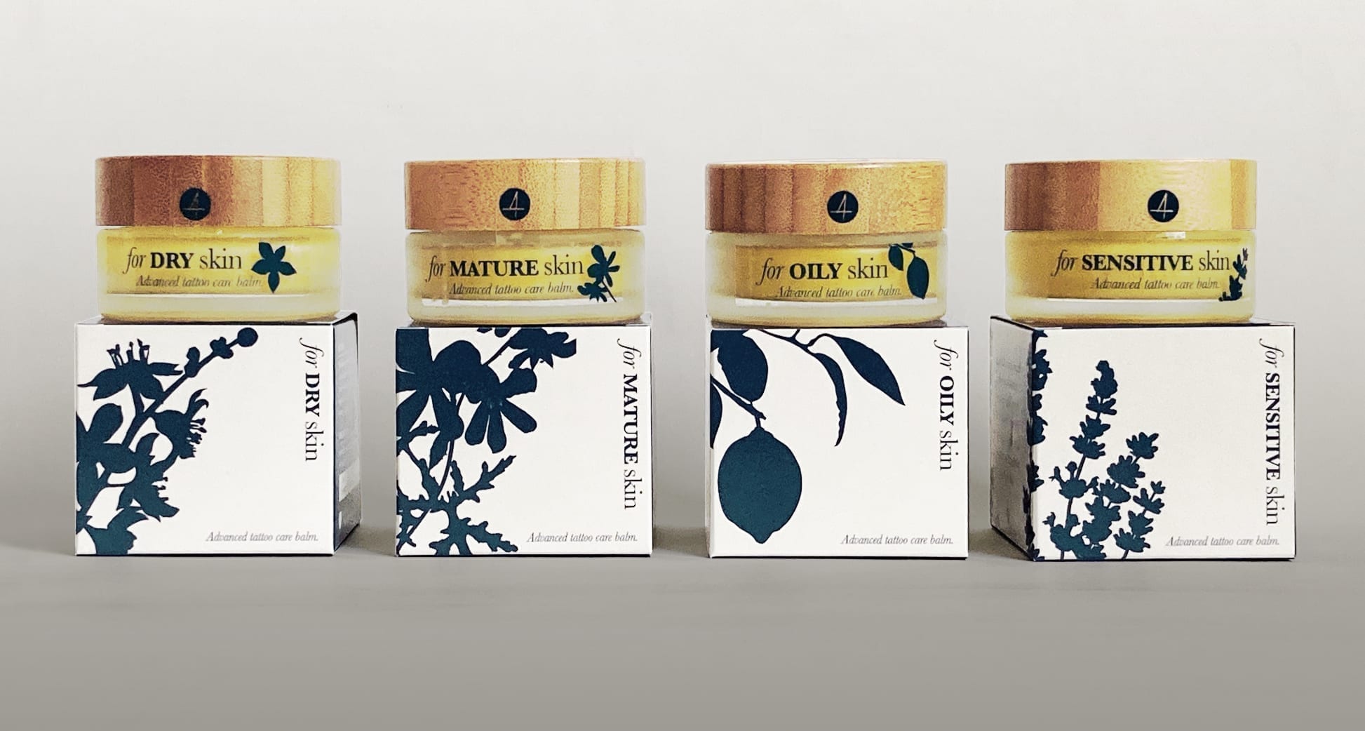
Four Tattoo Care packaging
The brief
Alice came to us with her idea: feminine focused tattoo care products. She wanted our solution to brake the current norm when it came to portraying her balms. To brake that link between tattoos and heavy bold gothic typefaces. She asked us to focus more on the beauty side of the market. To create branded packaging that looked just as at home in a salon or spa as they would in the studio.
The brief was to take her newly redeveloped identity and building upon it to create a visual language for all the materials and packaging of the new product range. The product branding should have a link the main brand, but should be definitely seen as a brand in its own right.
The brand identity was to cover a number of different skin areas: dry, sensitive, oily and mature. These four diverse skin types needed to be differentiated in a simple way. The final part of the brief was that the new extension needed to appeal to both a trade (tattoo studios, spas, salons etc) and also direct to customers.
What we did
This project had a number of stages, starting with identifying where would be best to position Four Tattoo Care’s new balm range. The results of this, balanced with the already existing colour pallet and fonts, took us to look at both the secondary and primary packaging.
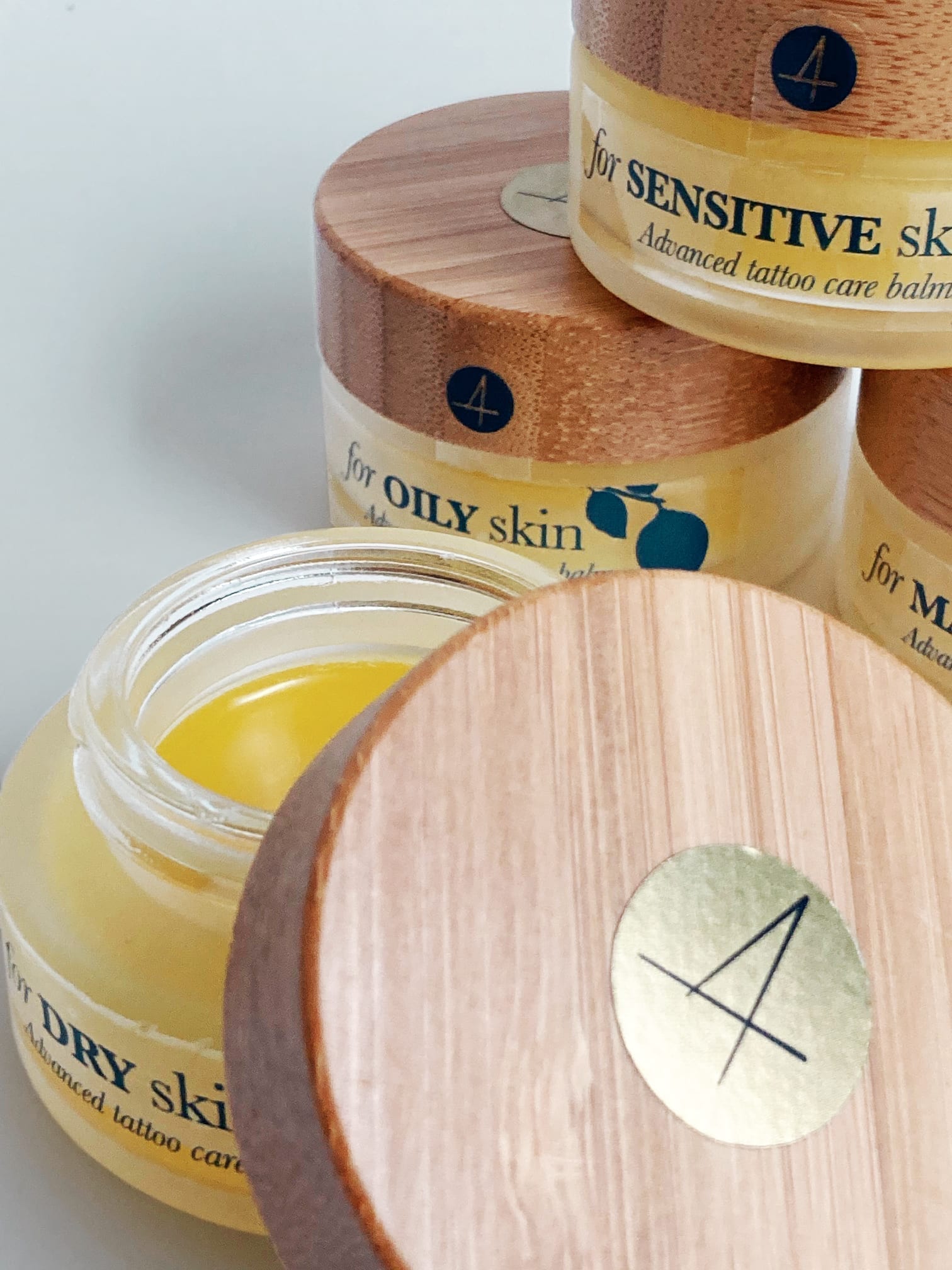
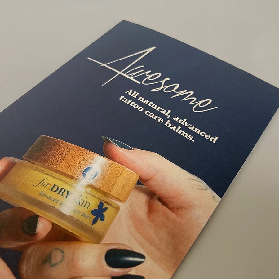
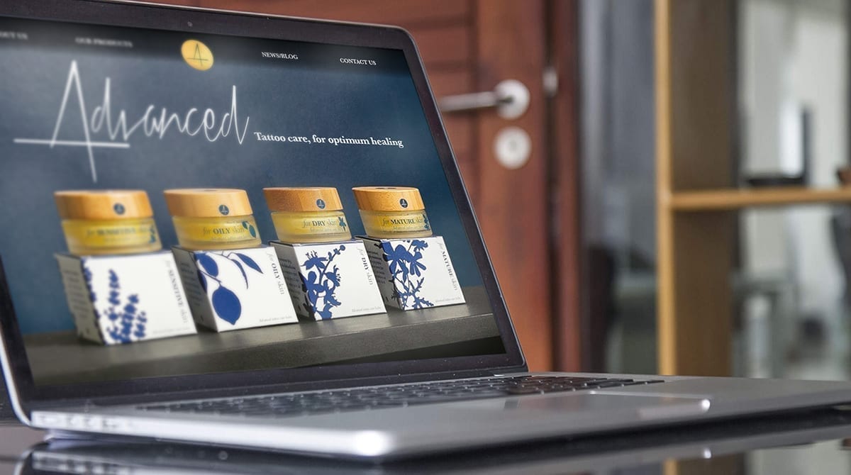
To connect with both the premium nature of the brand and the ‘natural’ cues of the product, glass and bamboo were proposed as the brand materials, identifying a number of possible suppliers. With the sizing of the jar, we created the bespoke pack solution with the in built ‘spacer’, to help give a larger on shelf impression.
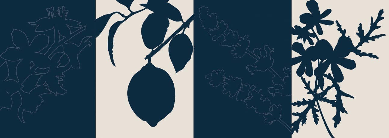
The illustrations were developed to give a strong visual language used on the balms alone. The silhuette allowed the brand colours to sing and build a consistent impression across the range. Whilst at the same time visually separating the products for dry, sensitive, oily and mature skin types.
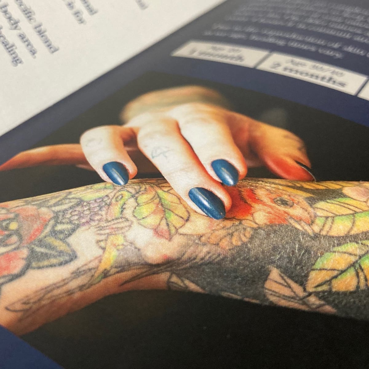
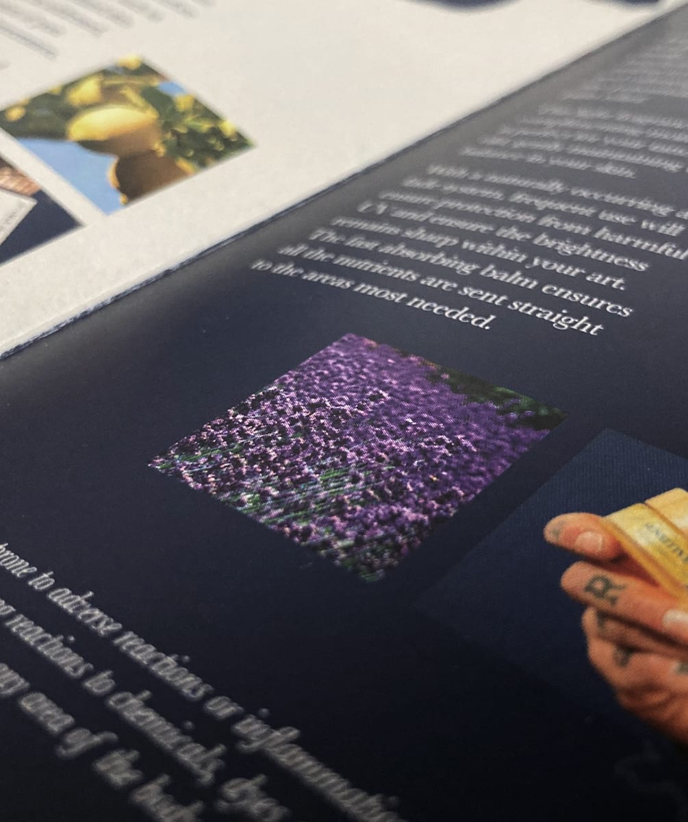
Every face of the new packaging for Four Tattoo Care is considered, building elegance and a strong brand language. This in turn is used on both literature and a proposed website. The final environmentally aware solution is an delicate balance of strong graphics and a muted colour pallet which will work across all of the current (and future) touch points to deliver the premium brand that was initially sought.
Downloads and info…
Client: Alice Nicholls
Website: www.four-tattoo.care
Naming
Brand extention
Structural packaging
Branded packaging
Illustrations
Literature
Product photography used within the leaflet by Jo Russell

Call 01206 580179 or mail us now…
Fancy a chat about your branding over Zoom? It’s FREE and could be the start of something big!

