Unify to conquer…
Bizagi branding unification
The brief
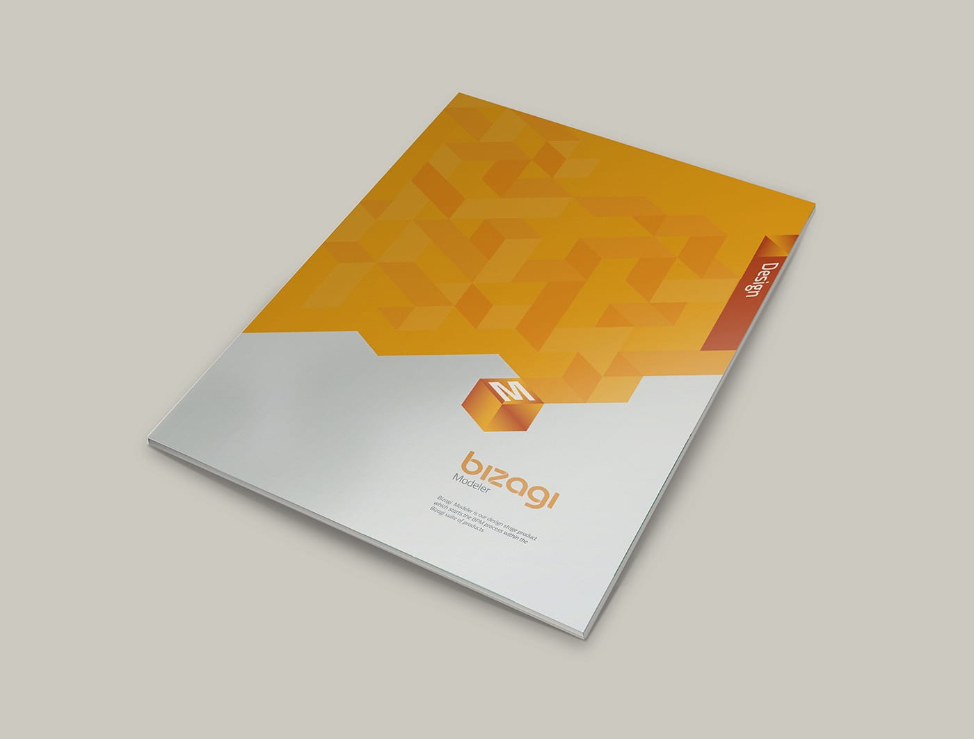
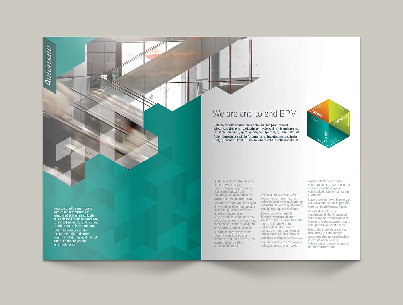
The challenge we had to address was that over time the Bizagi brand had been added to and amended. This had started to create ‘new’ branding elements, for differing parts of the business.
Our brief was to relook at the business and its branding and create of a unifying brand identity that would encompass all touch points. The solution needed to be uncomplicated and easily implemented across all businesses around the world.
What we did
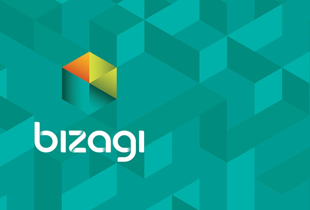
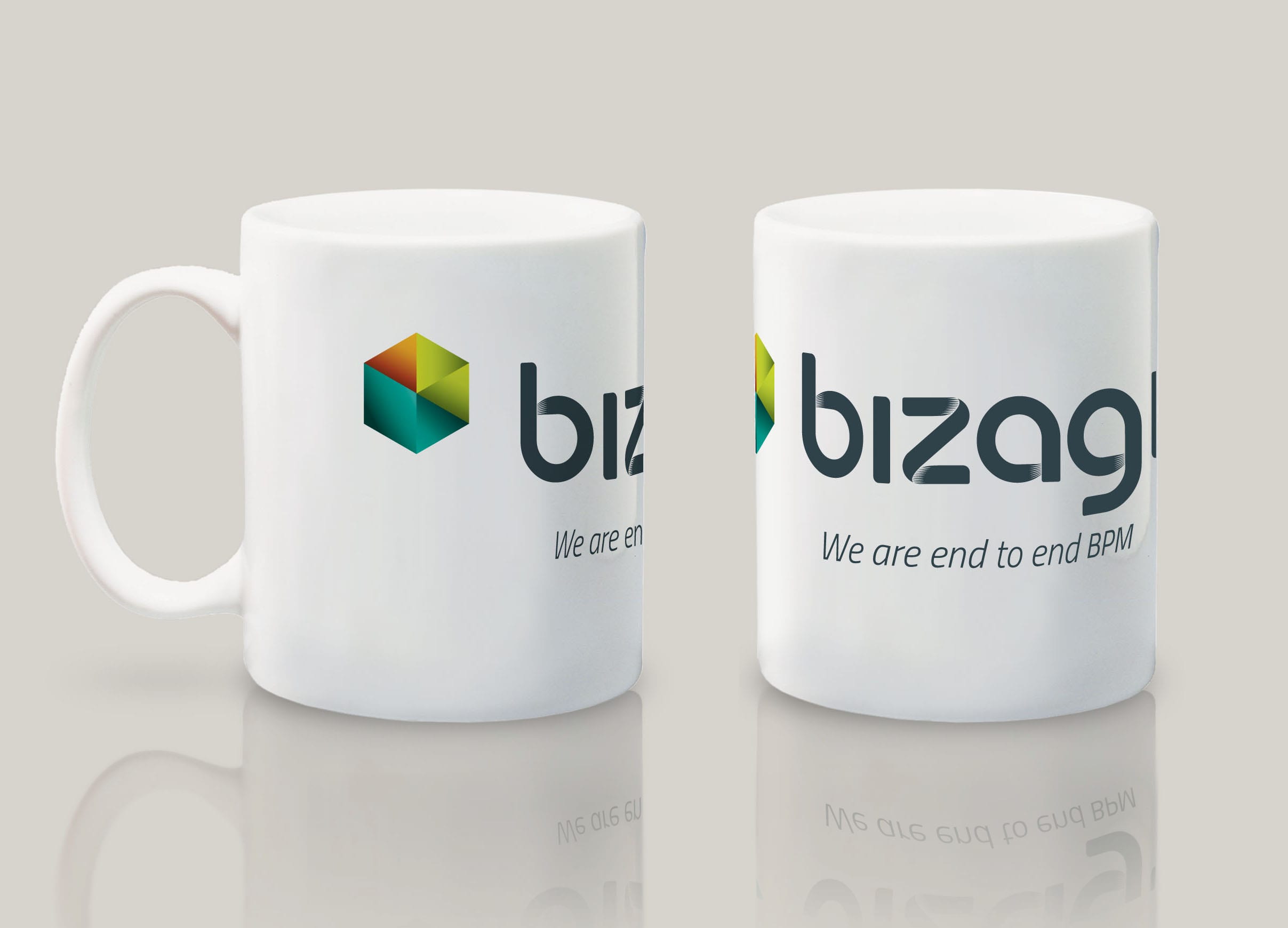
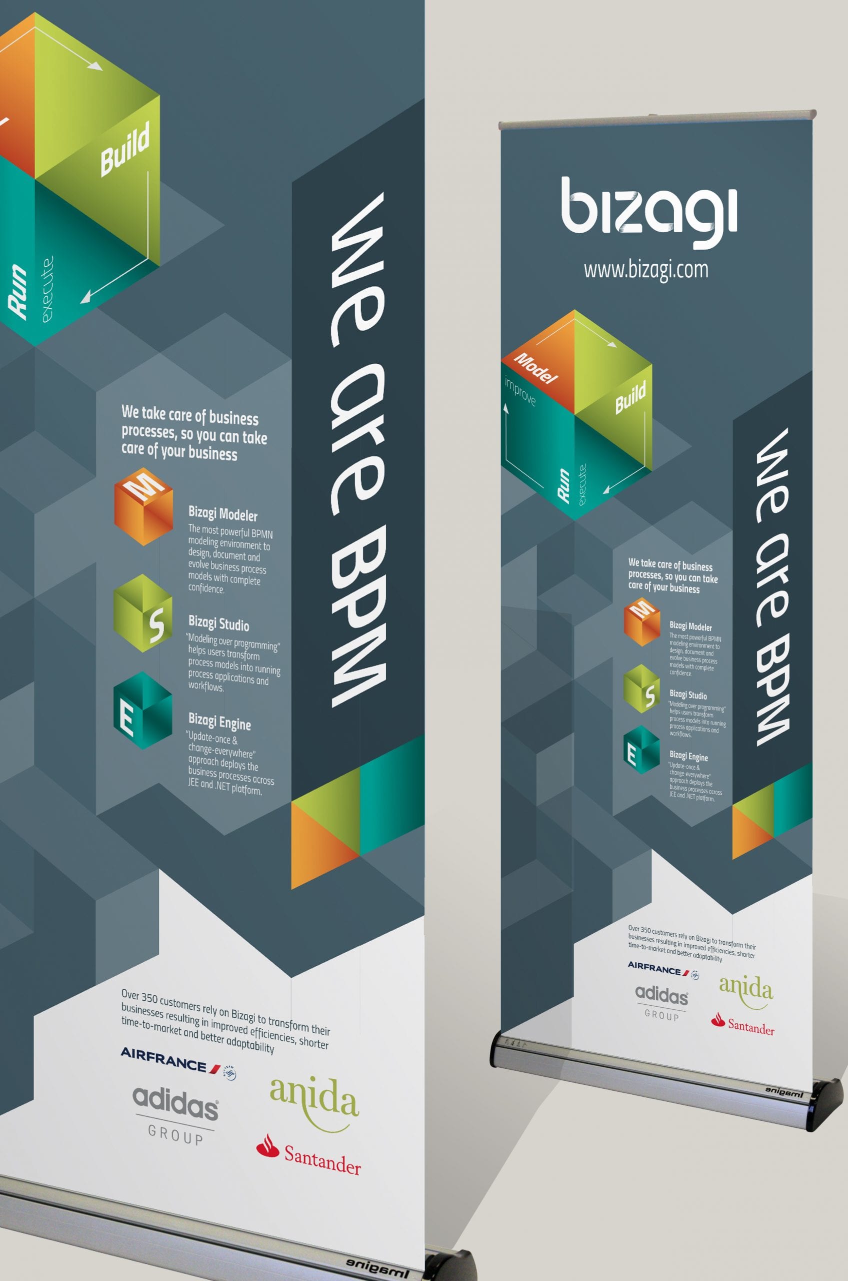
We answered with a simplified organic evolution of their current word mark, one that needed no additional colours to show the subtle shading. We also added the process symbol, a symbol that creates a link between the company and the process under which all its products sit.
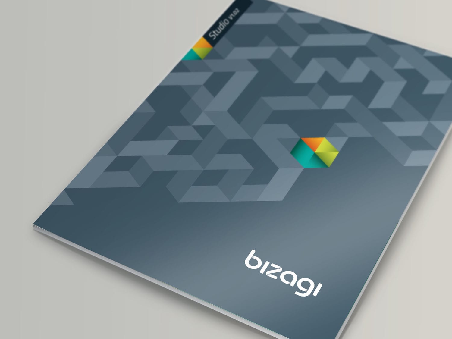
To invigorate the new identity, we also created a suite of textures which can work in tandem with the other branding elements. These textures can work across all print and digital applications to help ‘fuse’ the identity in the minds of the audience.
The final branding was elegant, flexible and memorable. Most importantly, the new identity linked all the areas of the business to the brand. And to ensure consistency, everything was delivered with an easy to understand set
of guidelines.
Downloads and info…
Client: Bizagi
Website: www.bizagi.com
Branding
Environmental graphics
Graphics
Merchandising
Guidelines
Internal templates
