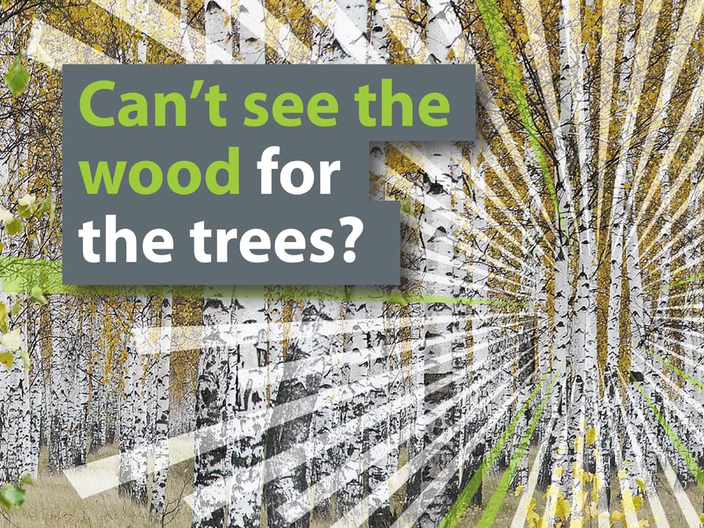
See the wood for the trees…
The brief
Our challenge was to create branding which would work both explicitly and implicitly, branding that was more than just a logo. This was to work across a raft of different applications from a pencil to a website.
What we did
The branding we developed reflects the enormous passion and dedication Karelia brings to its business. The focus device: a simple graphic which can be seen as both an explosion or a convergence of knowledge. Used as part of the brand mark and as a super graphic, it is the cornerstone of the Karelia identity.
To this we added tailored language and strong typographic treatment to create a final branding solution that is both flexible and dynamic. The final identity is a kit of parts that is both simple and memorable.
At a glance
- Client: Karelia Network Solutions
- Category: Branding, digital
- Website: karelia-ns.com


