
250 years in Essex and Suffolk
The brief
The brief was simple; to create a symbol or graphic that could be used across all print and digital material to mark the 250th celebration year and beyond. Also to create an something that could be used across all media to help illustrate this unique landmark date.

What we did
The first thing was to research what was going on back in 1768, find out land mark occasions along the time line. The more we looked the more we saw that the last 250 years have been quite a tumultuous time. It’s seen the creation of the USA, global wars and inventions that have changed the world.
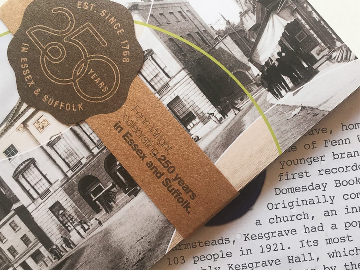
We wanted to show how things have changed, yet how Fenn Wright (and the places the estate agents exist) have been constant, how they’ve continued to deliver a consistent service all this time. The constant line seal device was a modern take on the traditional seal, but with the completely hand drawn 250 logotype. It is both elegant and simple.
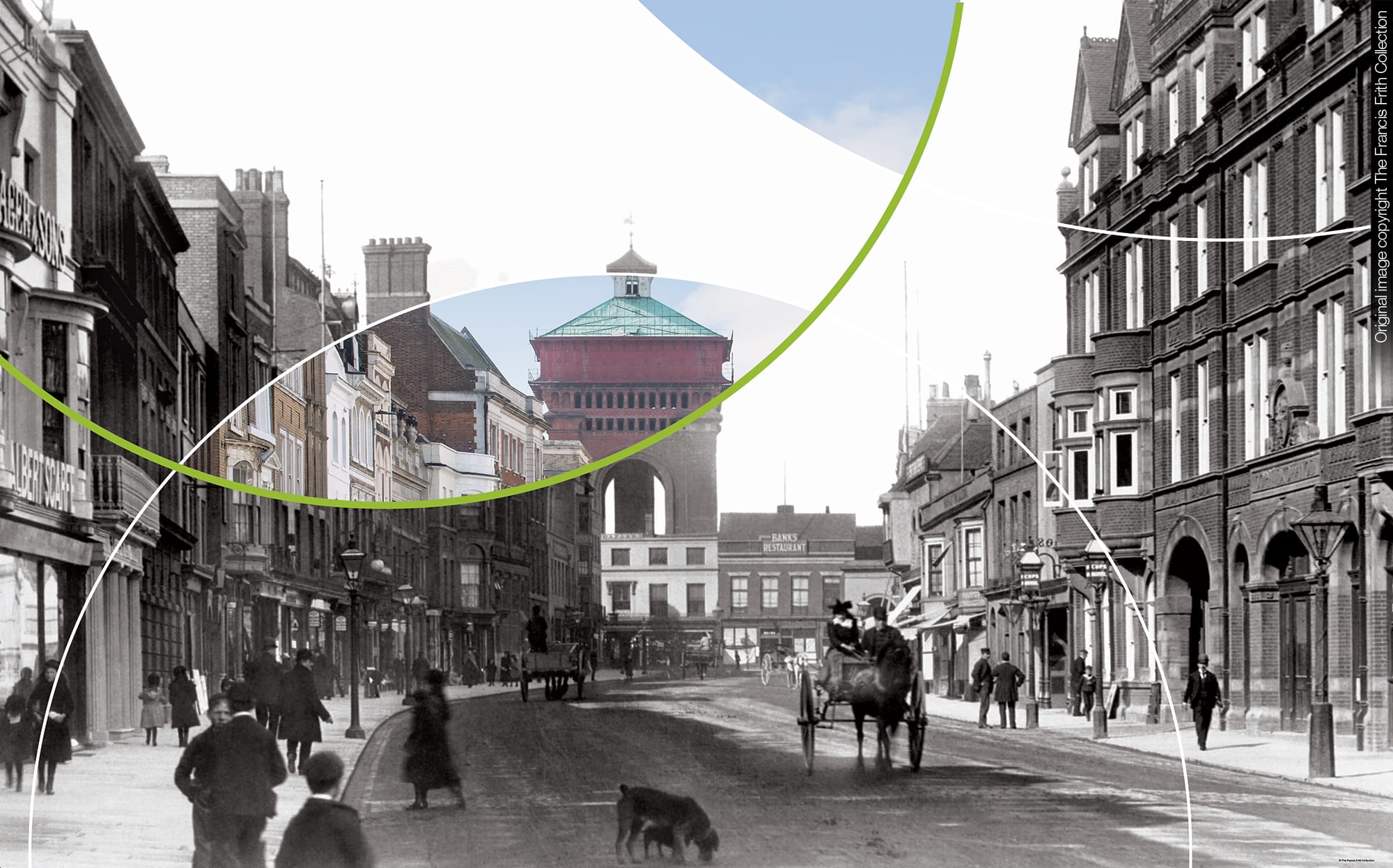
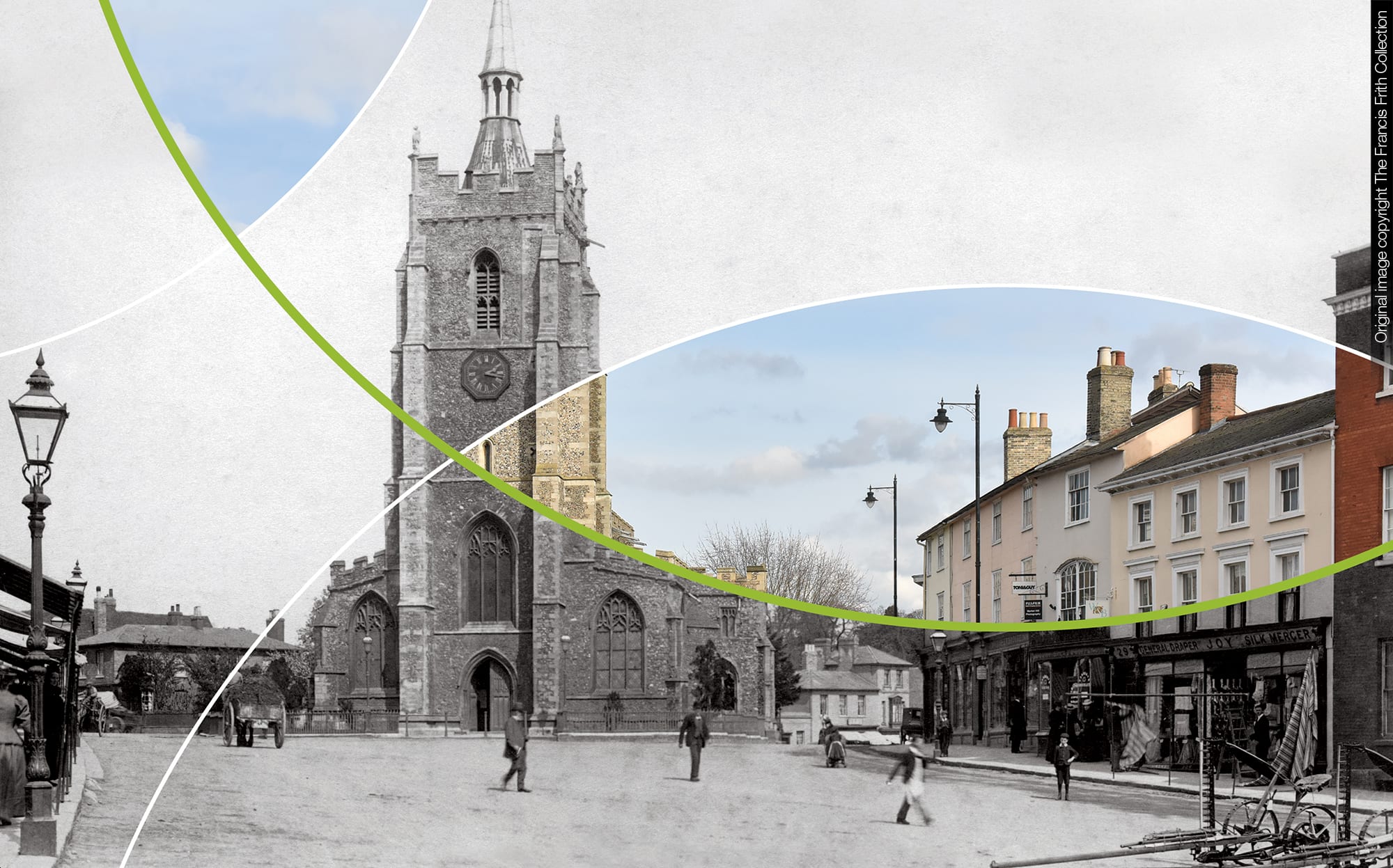
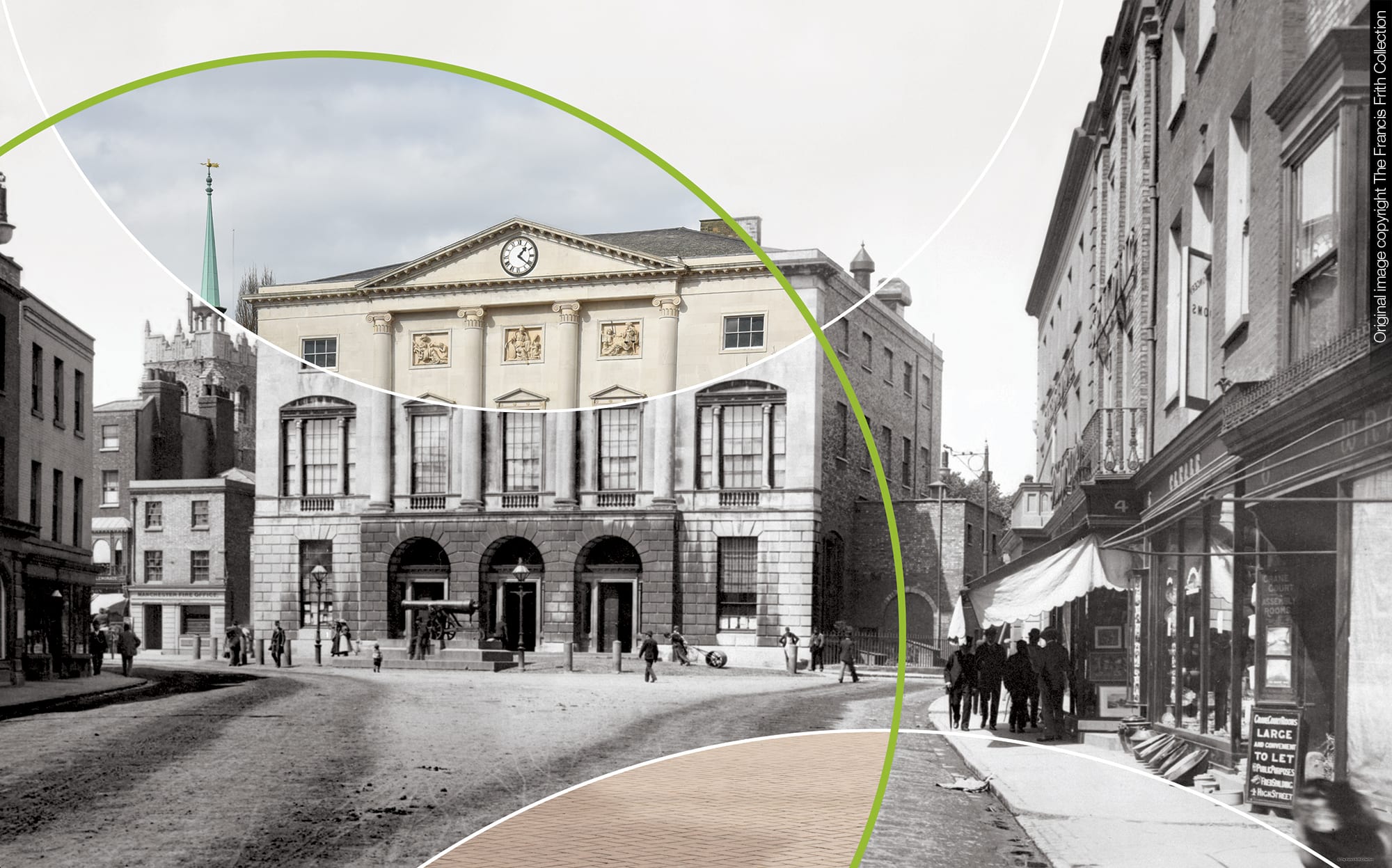
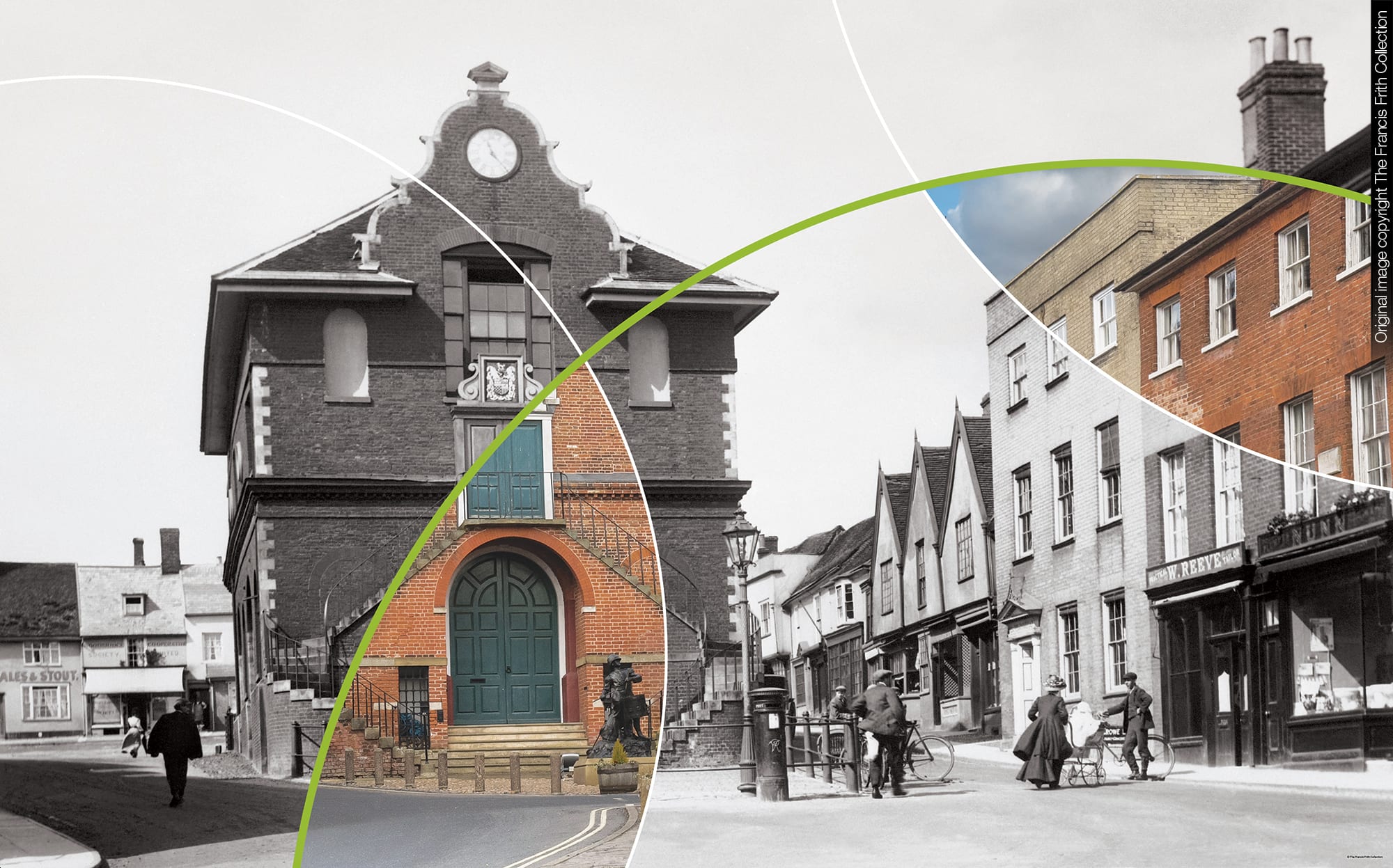
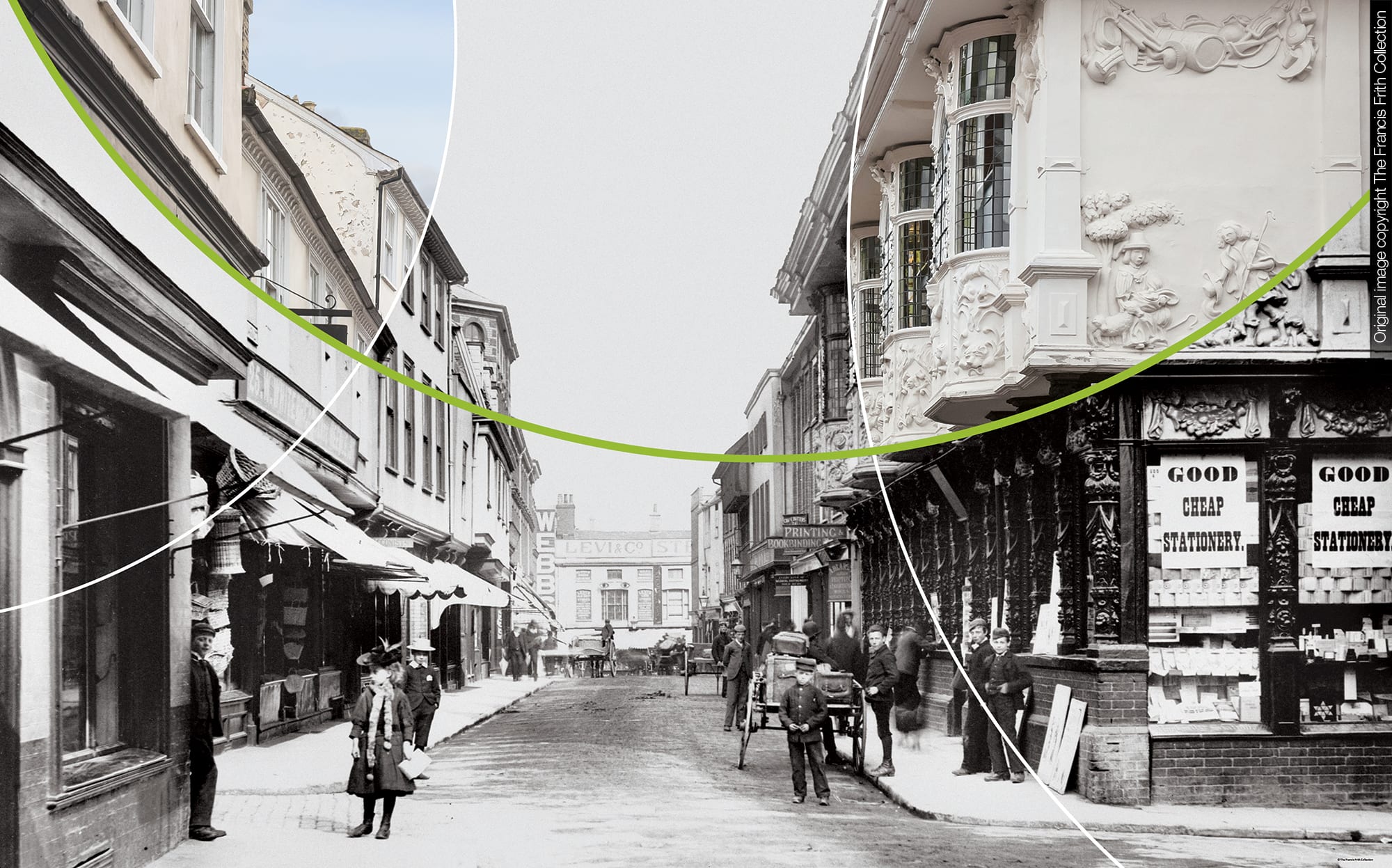
The solution to the challenge of how to show that time goes on, yet Fenn Wright stay consistent was achieved through the commissioning of a set of photographs to match historic images that we had selected from archives. These images were either from where Fenn Wright is based or the areas it covered.
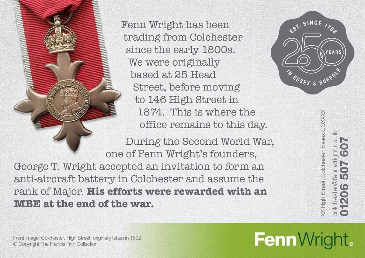
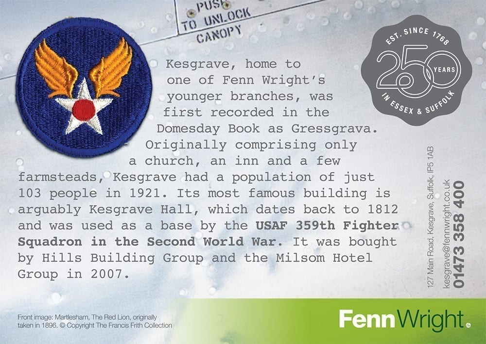
The final, retouched images were both interesting and elegant. A timeless reminder of a truly historic event not only for the estate agents, but also the region. Initially these have been delivered via the web and through a set of limited addition postcards. Each card’s reverse holds a short, but interesting story. Each one different, reflecting the tailored nature of Fenn Wrights and its service.
Downloads and info…
Client: Fenn Wright
Website: www.fennwright.co.uk
Art Direction
Branding
Advertising
Literature
Stationery
Gifting


