
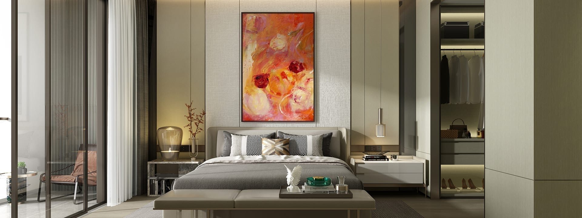
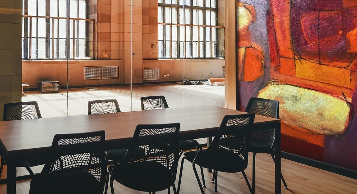
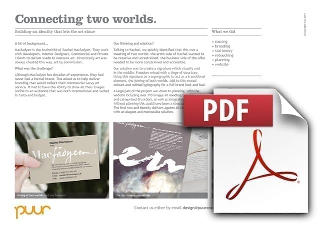
Macfadyen is the brainchild of Rachel Macfadyen. They work with Developers, Interior Designers, Commercial and Private Clients to deliver made to measure art. This could be for anything from public spaces to corporate boardrooms, to high profile housing developments. Historically art was always created this way, art by commission made to the specification of the sponsor. Macfadyen is the twenty-first century equivalent.
Bespoke art
The brief
Although Macfadyen has decades of experience, they had never had a formal brand. They asked us to help deliver branding that would reflect their commercial savvy art service. Whilst at the same time not forgetting their artist credentials.
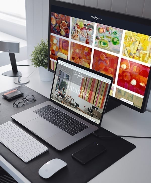
The project itself was focused around the development of a website. The website had to have the ability to show all their images online to an audience that was both international and varied (art buyers, architects, interior designers, commercial directors etc) in taste and budget. It had to have a simplicity to it, whilst at the same time be searchable.
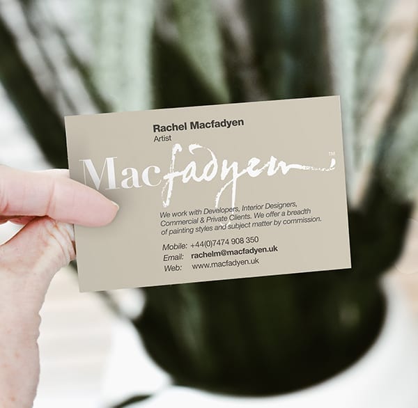
The branding had to work on a number of levels given that the audience was so wide and varied. It needed to be simple and easily remembered, it had to be able to be reproduced on the art as well as work as branding on everything from a business card to a website. It had to not distract from the art itself.
What we did
Talking to Rachel, we quickly identified that this was a meeting of two worlds: the artist side of Rachel wanted to be creative and unrestrained, the business side of her offer needed to be more solid and accessible.
Our solution was to create a signature which visually met in the middle. Freedom mixed with a tinge of structure. Taking elements from her actual signature and blending it with a classic typeface. Using this signature as a supergraphic to act as a transitional element, to represent the joining of both worlds.
Add to this a palette of earthy, muted colours and simple, refined typography for a full brand look and feel.
A large part of the project was down to planning. With the website including over 110 images all needling to be uploaded, retouched and categorised (in order), as well as integrating social media. Without planning this could have been a structural challenge. The final site and identity delivers against all the objectives with an elegant and memorable solution.
Downloads and info…
Client: Macfadyen
Website: www.macfadyen.uk
Naming
Branding
Stationery
Retouching
Planning
Website
Call 01206 580179 or mail us now…
Fancy a chat about your branding over Zoom? It’s FREE and could be the start of something big!
