
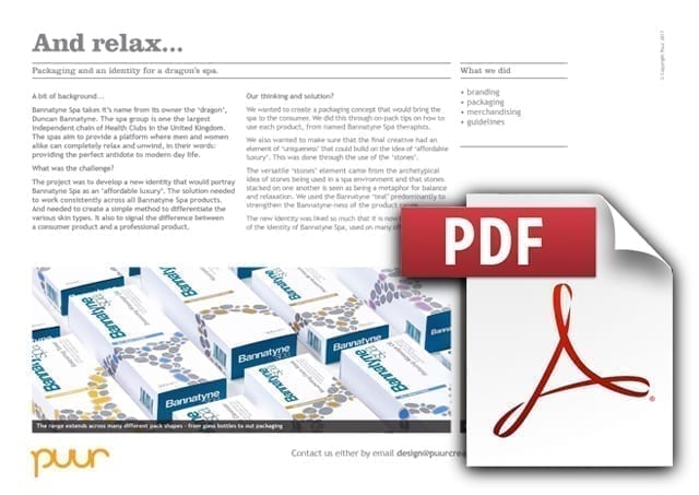
Bannatyne Spa takes it’s name from its owner the ‘dragon’, Duncan Bannatyne. The spa group is one the largest independent chain of Health Clubs in the United Kingdom. The spas aim to provide a platform where men and women alike can completely relax and unwind, in their words: providing the perfect antidote to modern day life.
And relax…
Bannatyne Spa packaging design
The brief
The project was to develop a new identity and packaging that would help portray Bannatyne Spa as an ‘affordable luxury’. The solution needed to work consistently across all Bannatyne Spa products. And needed to create a simple method to differentiate the various skin types.
As this was going to be rolled in both the spa environment and at retail areas within the Spas, the new packaging system also needed to signal the difference between a consumer facing product and the spa only, professional product.
Finally, when talking through the brief, we uncovered the fact that it would be desirable to bring in an element of ‘from the professionals’. Something that could signal, that the products that consumers were purchasing, was the same high quality products that were being used in the spas.
What we did
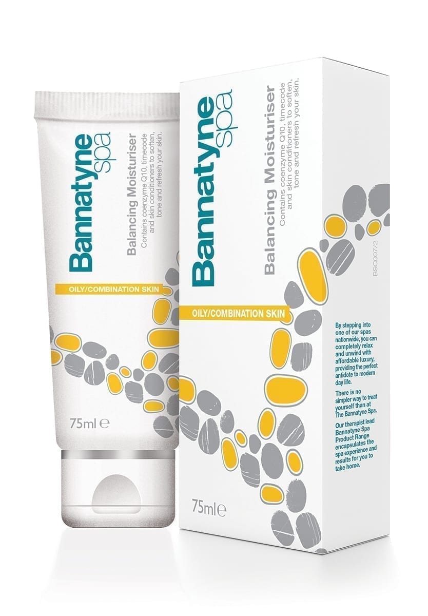
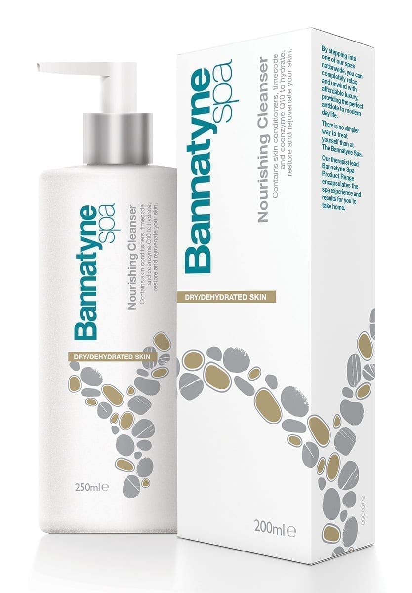
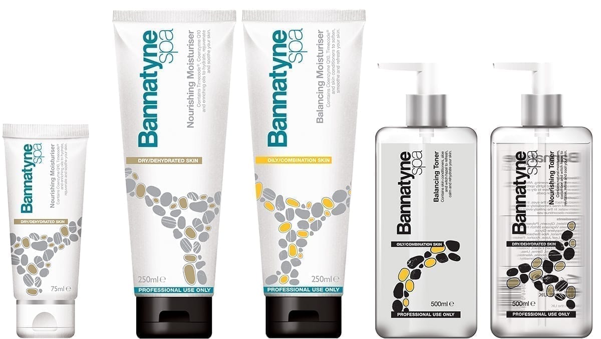
We wanted to create a packaging concept that would bring the spa to the consumer. We did this through easy to follow on-pack tips on how to use each product, from named Bannatyne Spa therapists, from named spas. These were written in a friendly, talkative style, as if the therapist was talking to the consumer.
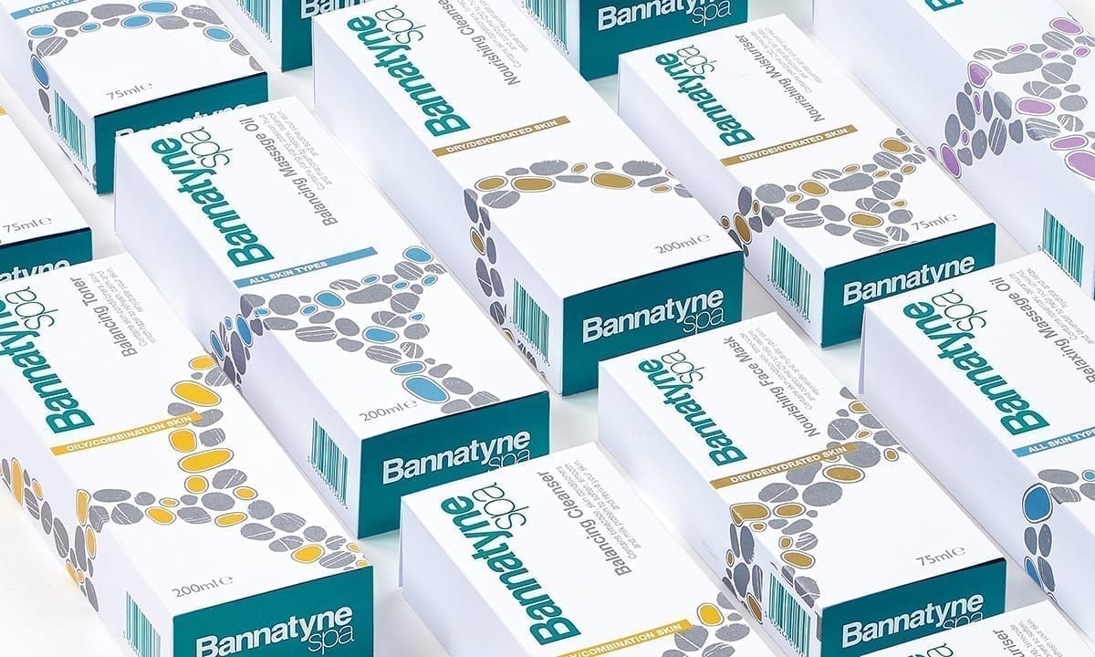
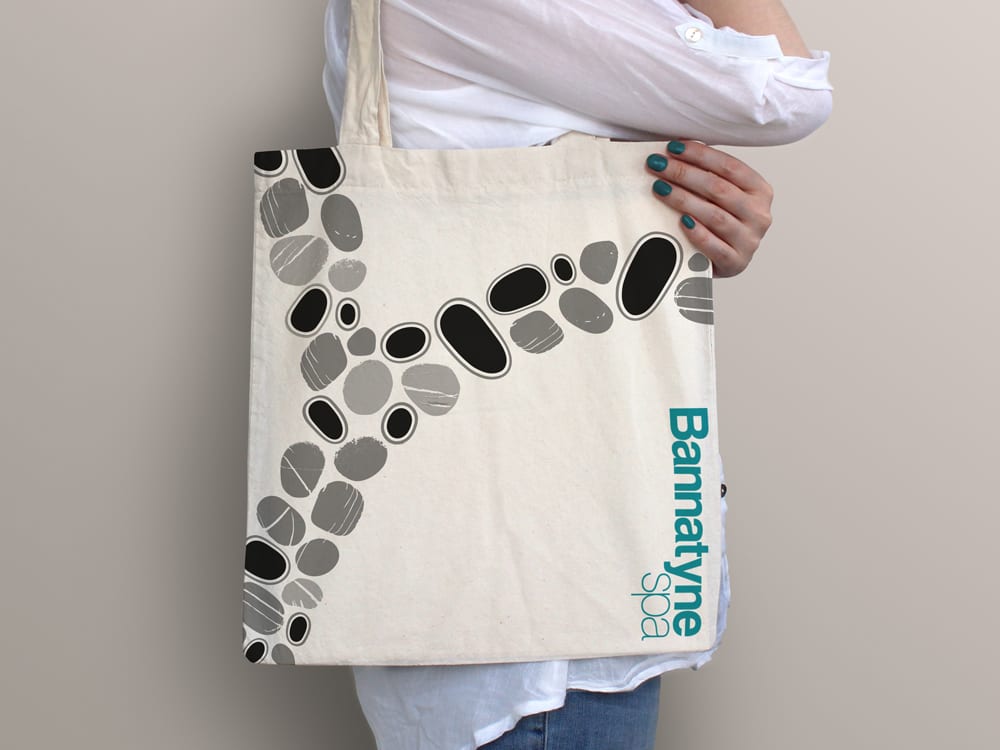
We also wanted to make sure that the final creative had an element of ‘uniqueness’ that could build on the idea of ‘affordable luxury’. This was done through the use of the ‘stones’.
The versatile ‘stones’ element came from the archetypical idea of stones being used in a spa environment and that stones stacked on one another is seen as being a metaphor for balance and relaxation. We used the Bannatyne ‘teal’ predominantly to strengthen the Bannatyne-ness of the product range.
The simple packaging system, created a structure that began to take on a life of its own. In fact, the new identity was liked so much that it is now becoming part of the identity of Bannatyne Spa, used on many off pack elements.
Downloads and info…
Client: Bannatyne Spa
Website: bannatyne.co.uk/spa
Branding
Packaging design
Merchandising
Photography

